# UI Augmentation
Virtuoso allows users to have some control over specific parts of the application interface. This can be achieved through the usage of Dynamic Forms and/or App Links.
# Dynamic Forms
Dynamic forms allow app creators to define custom forms with which the other users will interact, either to configure an app after installing it or to provide extra data after triggering an app action (see Creating an app).
# Example
Let's assume we have built an app for GitHub (opens new window).
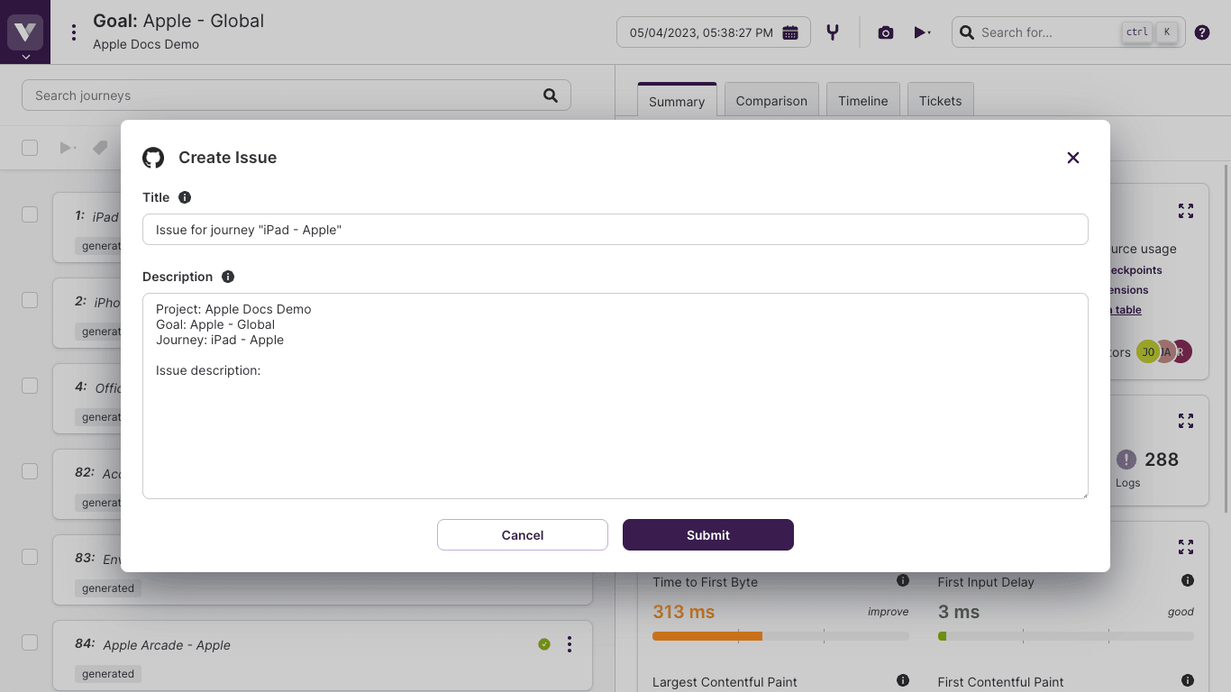
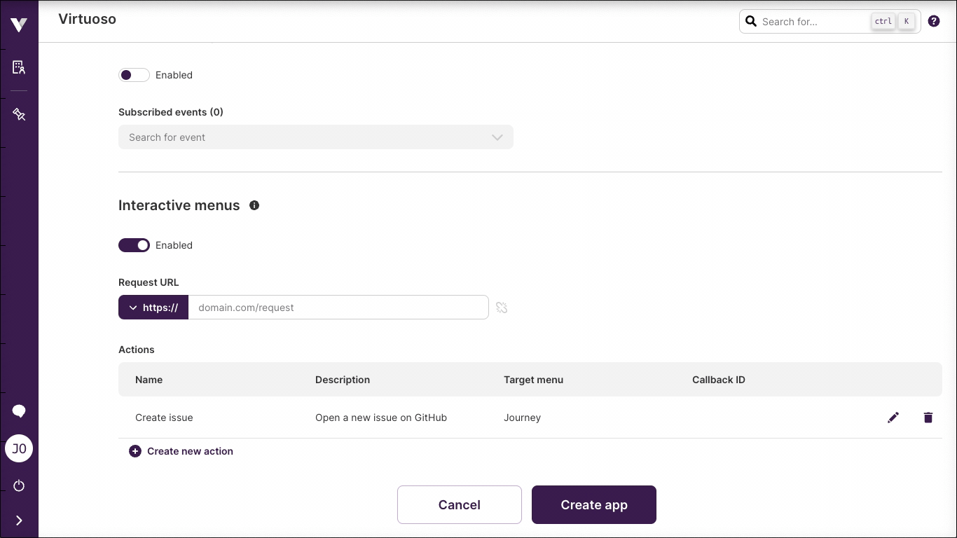
We may want to allow users to create GitHub issues directly from a journey's context menu by defining a title and a description. Additionally, we want those to come pre-filled with information from the journey (see the contextual information section).
With the apps' interactive menus feature we can place an action at the journey context menu.
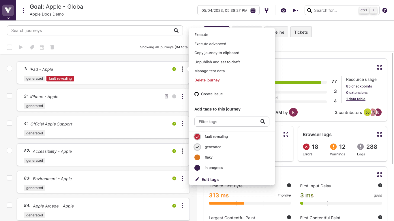
And by associating a dynamic form to that action, we can have the required fields displayed to the user:
A description of how forms can be easily built is divided into the following two sections:
- Dynamic Form structure describes how to create a form description and the available field types;
- Dynamic Form editor describes the editor features, including the ability to add contextual information.
# Dynamic Form structure
Dynamic Forms are mainly a way to structure different types of input fields. In this section, we present the formal language that you should use in order define the schema of the form to be rendered by Virtuoso.
A form contains fields or sections; a section is a way to organize group of fields; and a field is a graphical control element intended to enable the user to input some kind of data.
The form shown in the example above can be described by the following code:
{
  "fields": [
    {
      "name": "title",
      "type": "TEXT",
      "label": "Title",
      "defaultValue": "Issue for journey \"{{JOURNEY.name}}\""
    },
    {
      "name": "description",
      "rows": 10,
      "type": "TEXT_AREA",
      "label": "Description",
      "defaultValue": "Project: {{PROJECT.name}}\nGoal: {{GOAL.name}}\nJourney: {{JOURNEY.name}}\n\nIssue description:\n\n"
    },
    {
      "hint": "Check if the issue should be marked as a bug. Leave unchecked otherwise",
      "name": "isBug",
      "type": "SWITCH",
      "label": "Bug"
    }
  ]
}
This manual will now go over the different levels of this code and explain the reason for each one and how it can be configured.
# Form root
At the top level, a form is a very simple object that ties the rest of the elements together.
It has only two optional properties:
Fields added to the fields array will be rendered at the root of the form, with no section label or hint.
Root fields AND sections
Adding elements to both arrays is valid, however sections will take precedence and will cause the elements in the fields array to not render.
Basic form structure example
{
  "fields": [(...)],
  "sections": [(...)]
}
# Form sections
Any combination of fields may be added directly to the form root or further organized into sections, if they make sense as a group and/or require extra information for the user who will interact with them.
Sections are configured using the common field properties plus the following set of properties:
- label: the label of the section, presented at the top of the section
- hint optional: text meant to help / inform the users about the section's fields and required information, presented next to the label
- fields optional: an array of field objects
Basic form section structure example
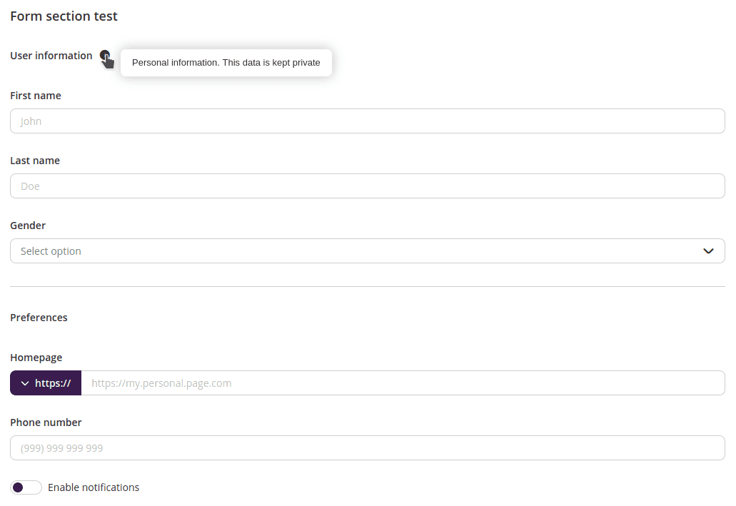
{
  "label": "User information",
  "hint": "Your personal information. This data will be kept private.",
  "fields": [(...)]
}
# Form fields
Fields are the main visual and functional components of a form. Each field type is better suited to a type of information.
# Common field properties
The main field properties, common for all types of field are:
- type: the type of the field (takes a different value for each field type);
- name: the name of the property that contains the field value when the form is submitted;
- label: the label of the field, presented above/next to the field itself;
- hint optional: text meant to help / inform the users filling the field, presented next to the label:
- disabled optionalupdatable: if
true, the value of the field cannot be changed (default isfalse); - hidden optionalupdatable: if
true, the field is included in the form but not shown to the user (default isfalse); - required optionalupdatable: if
true, the field must be filled before the form can be submitted (default isfalse); - defaultValue optional: prefilled value of the field which can be altered by the user unless field is marked as disabled (takes different types of data depending on the field type);
- value optionalupdatableupdate only: the value of the field. While it can't be defined when describing the form, it can be redefined during updates (takes different types of data depending on the field type);
- update optional: an array of other field names. When the current field value changes, these fields' properties may be updated;
However, the visual aspect and user experience are different for each field, requiring set of properties to fine-tune them. Currently, dynamic forms support the following types of fields (check each of them to learn their specifications):
# Text
Text fields allow users to input single words or short sentences.

Properties and example
Text fields are configured using the common field properties plus the following set of properties:
- type: TEXT;
- placeholder optional: text meant to help / inform the users filling the field, presented on the field itself until the user starts typing;
- maxLength optionalupdatable: maximum number of allowed characters when filling the field (
0orundefinedfor no limit); - secret optionalupdatable: if
true, the field contents will be obfuscated and non-copyable (default isfalse);
A json example of this field is shown below:
{
  "type": "TEXT",
  "name": "searchParameters",
  "label": "Search parameters"
  "hint": "Text that will be used to search for results",
  "placeholder": "Please insert your search parameters here",
  "defaultValue": "",
  "disabled": false,
  "hidden": false,
  "required": true,
  "maxLength": 0,
  "secret": false,
  "update": ["anotherField", "yetAnotherField"]
}
# Text Area
Text area fields are similar to simple text field but are better suited to larger texts.

Properties and example
Text area fields are configured using the common field properties plus the following set of properties:
- type: TEXT_AREA;
- placeholder optional: text meant to help / inform the users filling the field, presented on the field itself until the user starts typing;
- maxLength optionalupdatable: maximum number of allowed characters when filling the field (
0orundefinedfor no limit); - rows optional: number of rows (field height) the field will be rendered with. Texts that span over more than this value will be scrollable inside the text area (must be between
1and10);
A json example of this field is shown below:
{
  "type": "TEXT_AREA",
  "name": "userComments",
  "label": "Comments",
  "hint": "Your comments are anonymous and can't be traced back to your account",
  "placeholder": "Let us know your opinion",
  "defaultValue": "",
  "disabled": false,
  "hidden": false,
  "required": true,
  "maxLength": 0,
  "rows": 5,
  "update": ["anotherField", "yetAnotherField"]
}
# URL
URL fields are a variation of the simple text field, better suited to URL values. They offer a separate control to configure the protocol.

Properties and example
URL fields are configured using the common field properties plus the following set of properties:
- type: URL;
- placeholder optional: text meant to help / inform the users filling the field, presented on the field itself until the user starts typing;
A json example of this field is shown below:
{
  "type": "URL",
  "name": "targetPage",
  "label": "Target page",
  "hint": "Address of the webpage to target when searching for results",
  "placeholder": "Target page address",
  "defaultValue": "",
  "disabled": false,
  "hidden": false,
  "required": true,
  "update": ["anotherField", "yetAnotherField"]
}
# Switch
Switch fields are well suited to situations where the user should inform one of two possible values, e.g. yes/no, on/off, enabled/disabled, etc. The submitted value for these fields is either true or false.

Properties and example
Switch fields are configured using the common field properties plus the following set of properties:
- type: SWITCH;
A json example of this field is shown below:
{
  "type": "SWITCH",
  "name": "sendNotifications",
  "label": "Send notifications",
  "hint": "Set to true if notifications should be sent to your email",
  "defaultValue": true,
  "disabled": false,
  "hidden": false,
  "required": false,
  "update": ["anotherField", "yetAnotherField"]
}
# Dropdown
Dropdown fields allow users to select a value from a list of multiple options. The submitted value will be the value property associated with the selected dropdown option.

Properties and example
Dropdown fields are configured using the common field properties plus the following set of properties:
- type: DROPDOWN;
- placeholder optional: text meant to help / inform the users filling the field, presented on the field itself until an option is selected;
- options optionalupdatable: an array of dropdown option objects that will be presented to the user;
A dropdown option is an object with the following set of properties:
- value: the value submitted for the dropdown field if the option is selected (may be a
string,booleanornumericvalue); - label: the label that represents the option in the interface;
A json example of this field is shown below:
{
  "type": "DROPDOWN",
  "name": "deviceType",
  "label": "Device",
  "hint": "Select your preferred type of device",
  "placeholder": "Select type of device",
  "defaultValue": 1,
  "disabled": false,
  "hidden": false,
  "required": true,
  "update": ["anotherField", "yetAnotherField"],
  "options": [
    {
      "label": "Computer",
      "value": 1
    },
    {
      "label": "Phone",
      "value": 2
    },
    {
      "label": "Tablet",
      "value": 3
    }
  ]
}
# Markdown
Markdown fields allow users to enter rich, markdown-based descriptions or, conversely, view HTML content compiled from markdown code.
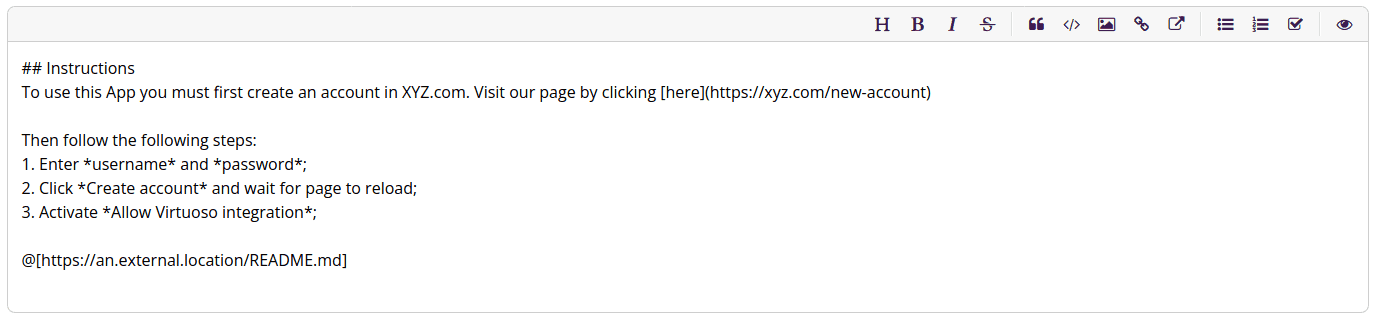
The editor comes with a preview mode and an action toolbar that helps the users enter the most commonly used markdown syntax elements and styles.
Appending external sources
Virtuoso added the Insert external markdown source action which lets the users point to an external, publicly available document, whose contents will be appended just before the field value is compiled to HTML.
This will be useful to users who wish to keep rich text content centralized outside of Virtuoso, e.g., in a git repository.
The external source syntax is:
@[url]
Attention: this is a Virtuoso-only addition to the markdown syntax and will most likely not produce the desired effect outside of Virtuoso.
If the field content is to be compiled to HTML outside of Virtuoso consider configuring the field to have allowExternalSources = false.
Properties and example
Markdown fields are configured using the common field properties plus the following set of properties:
- type: MARKDOWN;
- placeholder optional: text meant to help / inform the users filling the field, presented on the field itself until the user starts typing;
- height optional: height of the markdown editor / viewer. Content that spans over more than this value will be scrollable inside the editor / viewer area (must be equal or greater than
100); - readonly optionalupdatable: if
true, the field will be rendered in view mode, displaying HTML content compiled from the field's markdown value. Iffalse, the field will be rendered in edit mode, displaying an editor and action toolbar (default isfalse); - disableExternalSources optional: if
true, the field rendered in edit mode will not include theInsert external markdown sourcecustom action in the toolbar and, when in view mode, will not process the external source tags (default isfalse);
A json example of this field is shown below:
{
  "type": "MARKDOWN",
  "name": "richInstructions",
  "label": "Instructions",
  "hint": "If you use markdown syntax, the instructions will be rendered as HTML. Feel free to include bullet points, links or even images.",
  "placeholder": "Describe how to install and configure your Virtuoso app",
  "defaultValue": "",
  "disabled": false,
  "hidden": false,
  "required": false,
  "height": 300,
  "readonly": false,
  "disableExternalSources": true,
  "update": ["anotherField", "yetAnotherField"]
}
# Search
Search fields are similar to dropdown fields but the options are fetched from the application as the user types.

Properties and example
Search fields are configured using the common field properties plus the following set of properties:
- type: SEARCH;
- placeholder optional: text meant to help / inform the users filling the field, presented on the field itself until the user starts typing;
A json example of this field is shown below:
{
  "type": "SEARCH",
  "name": "targetUser",
  "label": "User to notify",
  "hint": "User that will be notified when action completes",
  "placeholder": "Search users by name or email address",
  "defaultValue": {
    "value": "111",
    "label": "John Doe"
  },
  "disabled": false,
  "hidden": false,
  "required": true,
  "update": ["anotherField", "yetAnotherField"]
}
As the user types, requests will be sent to the application containing all data required to identify which options should be sent back to Virtuoso.
These requests will contain data pertaining to their respective target menu and context, and will include the query data and current form values in the payload object.
The app should process the request and respond with an array containing all options.
Each search option can be defined as an object with the following set of properties:
- value: the value that uniquely identifies the option (may be a
stringornumericvalue); - label: the label that represents the option in the interface;
Field value
When the form is submitted, the selected option is sent whole, i.e., as an object containing both value and label.
{
  "value": "111",
  "label": "John Doe"
}
# Group
Group fields allow the creation of a list of items, each requiring the same set of fields to configure. The group field is displayed as a two column component: a list of items on the left side and a form to configure the selected item on the right.

Properties and example
Group fields are configured using the common field properties plus the following set of properties:
- type: GROUP;
- fields optional: an array of field objects. These will be used to create the right side form for each of the items;
- key optional: the name of an inner field. If defined, the value of that field will be used to identify each item on the left side list;
- addItemLabel optional: the label of the button to add a new item to the list (default is
Add item); - noItemsLabel optional: the label of the message shown on the left side when the list contains no items (default is
No items); - noItemSelectedLabel optional: the label of the message shown on the right side when no item is selected (default is
No item selected);
A json example of this field is shown below:
{
  "type": "GROUP",
  "name": "addresses",
  "label": "Addresses",
  "disabled": false,
  "hidden": false,
  "required": true,
  "key": "alias",
  "addItemLabel": "Add new address",
  "noItemsLabel": "No addresses found",
  "noItemsSelectedLabel": "No address selected",
  "update": ["anotherField", "yetAnotherField"],
  "fields": [
    {
      "type": "TEXT",
      "name": "alias",
      "label": "Alias",
      "placeholder": "Home, work, etc.",
      "required": true
    },
    {
      "type": "TEXT",
      "name": "address",
      "label": "Address",
      "placeholder": "Main St. 42",
      "required": true
    },
    {
      "type": "TEXT",
      "name": "additional",
      "label": "Additional info",
      "placeholder": "Floor, apartment, etc."
    },
    {
      "type": "TEXT",
      "name": "zip",
      "label": "ZIP code",
      "placeholder": "99999",
      "required": true
    },
    {
      "type": "DROPDOWN",
      "name": "country",
      "label": "Country",
      "required": true,
      "options": [...]
    },
    {
      "type": "SWITCH",
      "name": "billing",
      "label": "Is billing address"
    }
  ],
  "defaultValue": [
    {
      "alias": "Home",
      "address": "129 W. 81st St, New York",
      "additional": "Apartment 5A",
      "zip": "10024",
      "country": "1",
      "billing": "true"
    },
    {
      "alias": "Work",
      "address": "221B Baker St., London",
      "zip": "NW1",
      "country": "2"
    }
  ]
}
No nested group fields
To prevent the creation of forms too complex, group fields are not allowed inside another group field.
Each item in the group will be individually validated according to the properties of the fields used to configure the inner form. When submitting, the value of the group field will be an array containing, for each item, an object with its corresponding form value:
[
  {
    "alias": "Home",
    "address": "129 W. 81st St, New York",
    "additional": "Apartment 5A",
    "zip": "10024",
    "country": "1",
    "billing": "true"
  },
  {
    "alias": "Work",
    "address": "221B Baker St., London",
    "zip": "NW1",
    "country": "2"
  }
]
# Dynamic Form editor
In different parts of the application you may be required or offered the option to create and edit a Dynamic Form. In those situations you'll be presented with an editor:

This editor has some features specially tailored to Dynamic Forms: context placeholders, hints and errors, and actions,
# Context Placeholders
Forms may be rendered in a context, i.e. they may have an associated project, goal, or any other kind of entity used in the application. For interactive menu actions, for example, the form context relates to the menu where the action is included, as shown in the example above.
A user building forms for these situations may want to use values that will be available at the time the form is rendered but not when it is being built. Placeholders solve that limitation.
A placeholder is a sequence of characters that are included in the form description and then automatically replaced by the corresponding contextual value when the form is rendered. They have many useful applications, like showing a project name in a field label, goal id in a field's default value or the current date in a dropdown field options list.
Placeholder format
All placeholders consist of a string with the following format:
{{KEY_EXPRESSION.detailExpression}}
in which KEY_EXPRESSION is an uppercase, underscore _ separated expression and detailExpression is an optional camel case expression. If detailExpression is included, a dot . must separate both parts.
Available placeholders
The placeholders available to each form depend on the context it will be rendered in. This context may be either fixed (and pointed out to the form creator) or configurable at the time of form creation.
Configurable context dynamic forms include:
- Interactive menu actions (context is controlled by the Virtuoso menu associated with the action)
The following are the available placeholder KEY_EXPRESSION.detailExpression combinations for each context (some placeholders are available in more than one context):
Common placeholders (available independently of form context)
| Key | Detail | Description | Replacement example |
|---|---|---|---|
| NOW | The instant the form is displayed to the user, presented as in ISO 8601 (opens new window) format | 2020-06-26T13:10:05.664Z | |
| CURRENT_URL | The URL of the page at which the interaction is being triggered | https://app.virtuoso.qa/#/project/1234/project-dashboard/goals |
Organization placeholders (available independently of form context)
| Key | Detail | Description | Replacement example |
|---|---|---|---|
| ORGANIZATION | id | The identifier of the organization | 1234 |
| ORGANIZATION | name | The name of the current organization | ACME Corp. |
| ORGANIZATION | url | The URL to the Organization Dashboard | https://app.virtuoso.qa/#/organization/1234/projects |
Project placeholders (available in PROJECT context or to any entity under a project)
| Key | Detail | Description | Replacement example |
|---|---|---|---|
| PROJECT | id | The identifier of the project | 1234 |
| PROJECT | name | The name of the project | Shopping Cart page test |
| PROJECT | url | The URL to the Project Dashboard | https://app.virtuoso.qa/#/project/1234/project-dashboard/goals |
Goal placeholders (available in GOAL context or to any entity under a goal)
| Key | Detail | Description | Replacement example |
|---|---|---|---|
| GOAL | id | The identifier of the goal | 1234 |
| GOAL | name | The name of the goal | Desktop test |
| GOAL | url | The URL to the goal | https://app.virtuoso.qa/#/project/123/goal/1234/v/12345 |
| GOAL | latestSnapshotId | The identifier of the goal's latest snapshot | 1234 |
Journey placeholders (available in JOURNEY context or to any entity under a journey)
| Key | Detail | Description | Replacement example |
|---|---|---|---|
| JOURNEY | id | The identifier of the journey | 1234 |
| JOURNEY | title | The full title of the journey | Journey 12: Add item to shopping cart |
| JOURNEY | name | The name of the journey | Add item to shopping cart |
| JOURNEY | number | The journey number | 12 |
| JOURNEY | summary | The summary of the journey | This journey tests the shopping cart functionality. Lorem ipsum dolor sit amet... |
| JOURNEY | canonicalId | The UUIDv4 identifier of the journey | 11bf5b37-e0b8-42e0-8dcf-dc8c4aefc000 |
| JOURNEY | snapshotId | The identifier of the journey's snapshot | 1234 |
| JOURNEY | draft | Is the journey in draft state? (true / false) | true |
| JOURNEY | tags | The comma-separated list of tags associated with the journey | some test, flaky, shopping cart |
| JOURNEY | url | The URL to the journey | https://app.virtuoso.qa/#/project/123/goal/1234/v/12345/journey/123456 |
Checkpoint placeholders (available in CHECKPOINT context or to any entity under a checkpoint)
| Key | Detail | Description | Replacement example |
|---|---|---|---|
| CHECKPOINT | id | The identifier of the checkpoint | 1234 |
| CHECKPOINT | title | The title of the checkpoint preceded by its number | Checkpoint 123: Login to ACME Corp |
| CHECKPOINT | name | The title of the checkpoint preceded by its number | Login to ACME Corp. |
| CHECKPOINT | number | The number of the checkpoint | 123 |
| CHECKPOINT | canonicalId | The UUIDv4 identifier of the checkpoint | 11bf5b37-e0b8-42e0-8dcf-dc8c4aefc000 |
Step placeholders (available to any entity under a step)
| Key | Detail | Description | Replacement example |
|---|---|---|---|
| STEP | id | The identifier of the step | 1234 |
| STEP | description | The step action description | Store element details of "Accept" in $submitButton |
Execution placeholders (available in EXECUTION context or to any entity under an execution)
| Key | Detail | Description | Replacement example |
|---|---|---|---|
| EXECUTION | id | The identifier of the execution | 1234 |
| EXECUTION | duration | The total duration of the execution in milliseconds | 13543 |
| EXECUTION | resolution | The resolution of the browser used in the execution (w x h) | 1920 x 1080 |
| EXECUTION | deviceName | The name of the device used in the execution | Virtuoso Browser |
| EXECUTION | startDate | The instant the execution started, presented as in ISO 8601 (opens new window) format | 2020-06-26T13:04:57.931Z |
| EXECUTION | endDate | The instant the execution ended, presented as in ISO 8601 (opens new window) format | 2020-06-26T13:10:05.664Z |
| EXECUTION | dataDriven | Was the execution data driven? (true / false) | false |
| EXECUTION | sequenceCount | The number of sequences in the execution (test data rows) | 4 |
| EXECUTION | sequenceNumber | The number of the selected sequence | 2 |
| EXECUTION | sequenceDuration | The duration of the selected sequence in milliseconds | 5672 |
| EXECUTION | sequenceOutcome | The outcome of the selected sequence | Passed |
| EXECUTION | environmentId | The identifier of the environment used in the execution | 1234 |
| EXECUTION | environmentName | The name of the environment used in the execution | Staging |
| EXECUTION | screenshotUrl | The URL to the step execution's screenshot | https://virtuoso-screenshots-abc.amazonaws.com/abc123.png |
| EXECUTION | url | The URL to the execution | https://app.virtuoso.qa/#/project/123/execution/1234/journey/12345/checkpoint/123456/step/1234567/screenshot?sequence=2 |
Variable context elements availability
EXECUTION context may or may not contain journey, checkpoint, step, and sequence information, depending on those elements being selected in the UI.
Based on the selection, the information related to some of the placeholders above may not be available when the form is rendered. They'll be replaced with N/A instead.
Extension placeholders (available in EXTENSION context or to any entity under an extension)
| Key | Detail | Description | Replacement example |
|---|---|---|---|
| EXTENSION | id | The identifier of the extension | 1234 |
| EXTENSION | name | The name of the extension | requestShoppingCartItems |
Organization extensions
Extensions can be created at project or organization level. Project level extensions will have an associated project but organization level ones will not. This means that if the form is rendered in an organization level context, the project related placeholders will not be replaced. Keep this in mind when creating your dynamic forms.
Test Data Table placeholders (available in TEST_DATA_TABLE context or to any entity under a test data table)
| Key | Detail | Description | Replacement example |
|---|---|---|---|
| TEST_DATA_TABLE | id | The identifier of the test data table | 1234 |
| TEST_DATA_TABLE | name | The name of the test data table | Items test data |
| TEST_DATA_TABLE | description | The description of the test data table | This table contains data for multiple shopping cart items |
While editing a form description, if the user starts typing { on a string property value, the editor will present a list of all available placeholders in that context.
To accept just press Enter or Tab.
In a goal context, this field would render similar to:

# Editor Hints and Errors
The editor will guide you through creating a form description. It can do this in two ways: hints and errors.
Hints will be provided when you hover a part of the code with the mouse cursor, and disappear when you move it away.
They can include the name of the part you're editing (whether it is the form root, a section or a particular type of field), extended descriptions on any of these parts, and tips about required properties or their accepted values.


Errors will be shown below the editor area and will point only the faults int the form structure, missing required properties or invalid property values.

Forms with errors
While the editor identifies errors in the form description, its value cannot be saved and the editor actions cannot be used.
# Editor Actions
At the top of the editor there are three action buttons:
# Re-indent form description
Clicking this button will re-indent the code, with individual properties being separated into different lines. Bear in mind that code style does not affect the rendered form; only the form description content does.
# Copy form description to clipboard
Clicking this button will copy to clipboard the current code on the editor.
# Reset form description to its default state
Clicking this button will revert the form to its most simple and valid state, i.e. an empty fields array. This is equivalent to not defining any form since nothing will be rendered.
# App links
App links can be added to certain types of Virtuoso entities and serve as visual indicators or links to entities, pages or resource states outside of Virtuoso.
# Example
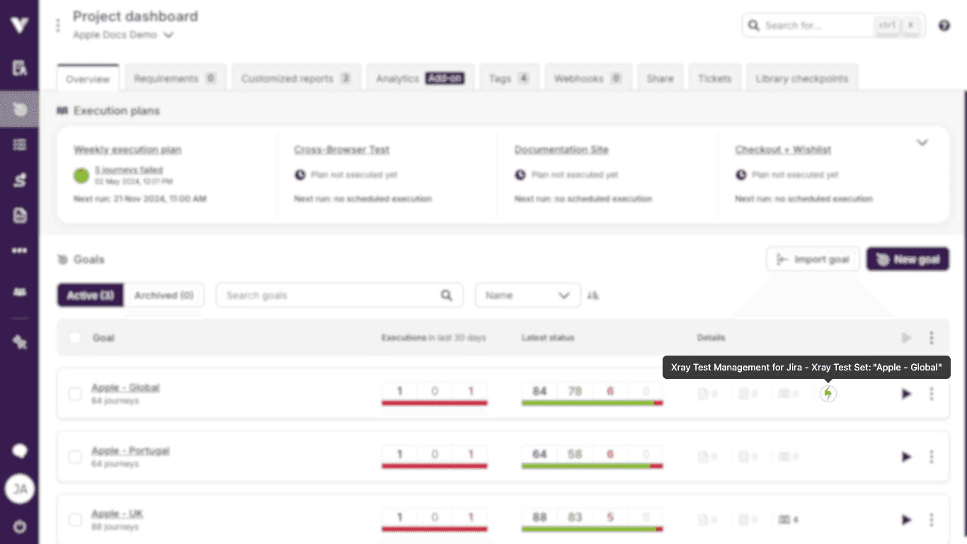
Let's assume we have built an app for Xray (opens new window) which allows users to create Xray issues associated with Virtuoso goals.
With app links, the app can place small indicators in the goal cards, one for each Xray issue, that will redirect the user to said issue when clicked.
# Properties and appearance
App links will show as small, clickable image links. They will display the icon of their corresponding app, if defined, or the icon by omission.
An app may create, update and delete app links through Virtuoso API. Among the several properties that must be configured for each link, a few have a direct impact on what users will see:
- label - the link label will be displayed as a tooltip, preceded by the app name;
- url - if the icon has a URL, clicking it will open a new browser tab and redirect it to the target;
- state - if
DISABLEDthe link will show as a grayscale, non-clickable image. Set toENABLEDotherwise; - entityType - the type of Virtuoso entity the link will be added to. Available types are:
- PROJECT
- GOAL