# Goal and journey summary
The goal summary delivers important insights into your goals and their executions in a single place. To access it, navigate to the Goal view and view the Summary tab on the right-side panel.
The summary is available as soon as you create a goal, providing information about the tests and related execution plans. However, most of the information will only become available once you execute one or more journeys.
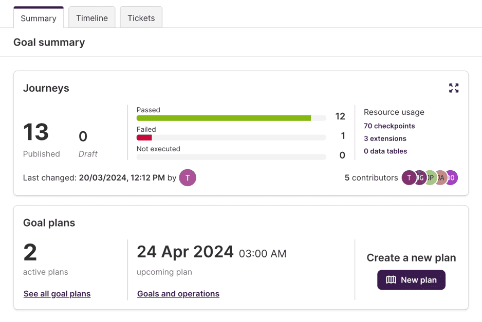
# Journeys
The Journeys section, at the top of the summary, provides the answer to a set of basic questions on the goal:
- How many journeys are in this goal? How many are published and how many are still in a draft state?
- How many distinct checkpoints are the journeys divided into?
- How many extensions and how many data tables are used in the tests?
- When was the last change to any of the tests? Who made that change?
- Which users have contributed to this goal?
- How many tests passed, failed or were not executed on their last execution?

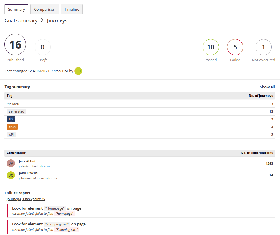
# Detailed view
To get a better overview of your journeys, open the journeys detailed view by clicking the icon in the top-right corner of the section.
This provides you with a tag summary listing all tags used in the goal and how many journeys they're associated with, and a table of goal contributors.
It also includes a failure report, which lists all failing steps across the goal, together with the reason for failure. Click each of the steps to see its details and root cause analysis. Read more about root cause analysis →
# Goal plans
The Goal plans section displays in a very succinct way:
- How many active execution plans are targeting the whole goal or any of its journeys;
- Which plan is the scheduled next to be executed for this goal;

The links allow you to access the plans directly; see Managing plans for more information about plans.
# Single journey summary
When a single journey is opened on the left-side panel of the Goal view, the summary sections will focus on that single journey.
The Journeys section will display the latest status of the selected journey, when was it last changed and which user did that change, the list of users who contributed to the journey, along with the counts for test steps on the journey, and the number of extensions used.

Same as the Journeys section it can be expanded, by clicking the icon in the top-right corner of the section, to reveal a table of journey contributors and a failure report. Each of the failing steps can be clicked to reveal its details and root cause analysis. Read more about root cause analysis →
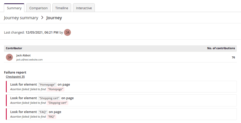
Other sections such as network requests, performance, plans, etc. will also automatically adapt to the specific journey, showing data only for the given journey.
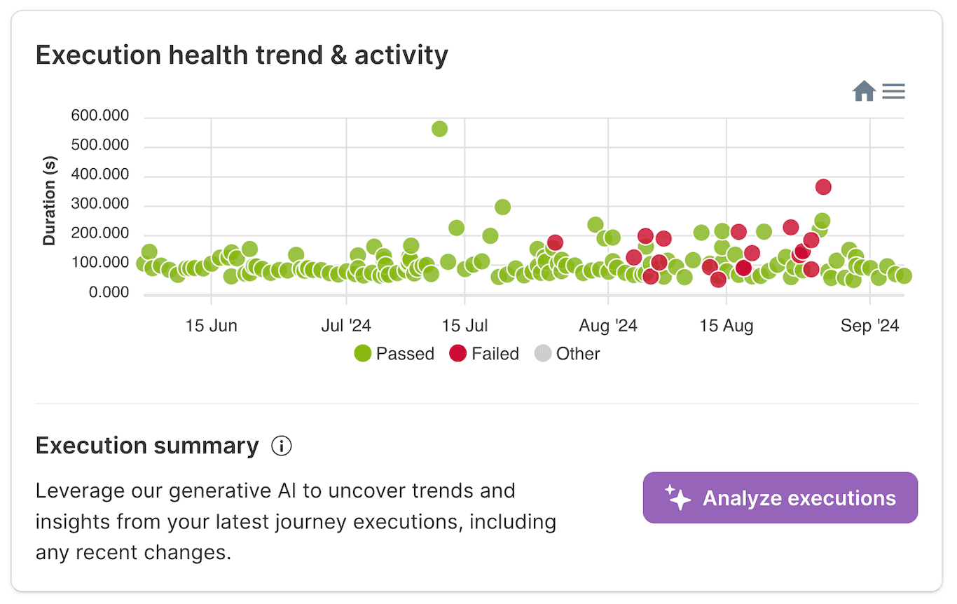
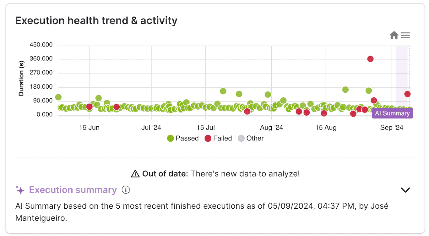
In addition, a new section will be available: the Execution health trend & activity. This displays a single chart where the executions of the journey are plotted over time, for up to the last 90 days. Each circle represents an execution, where the color represents the outcome of the execution, and the y-axis represents how long it took to finish.

Overlaying the plot, the changes to the journey, as well as user comments, will be displayed as markers to help you see when they may have changed the execution results or their performance.
The chart is interactive: you can drag your mouse over the chart to zoom in on specific time ranges, and hover any point or marker to display some of their details.
# AI-powered Execution Summary
Leveraging the power of generative AI, you can swiftly access and evaluate your recent journey execution results.
Nestled beneath the execution health trend and activity section, discover the option to generate a comprehensive AI driven journey execution summary, drawing on the rich data from the journey's prior executions.
The generated summary provides an analysis to measure the impact of recent changes on the execution outcomes of the journey. It helps you identify any issues related to the journey changes.
In the execution health trend, a purple overlay indicates the timespan window considered for the analysis. Below the overlay, statistics of executions for that same time window are displayed.
The summarization of this timespan correlates the changes made with the execution outcomes, providing valuable insights into the results of the journey.
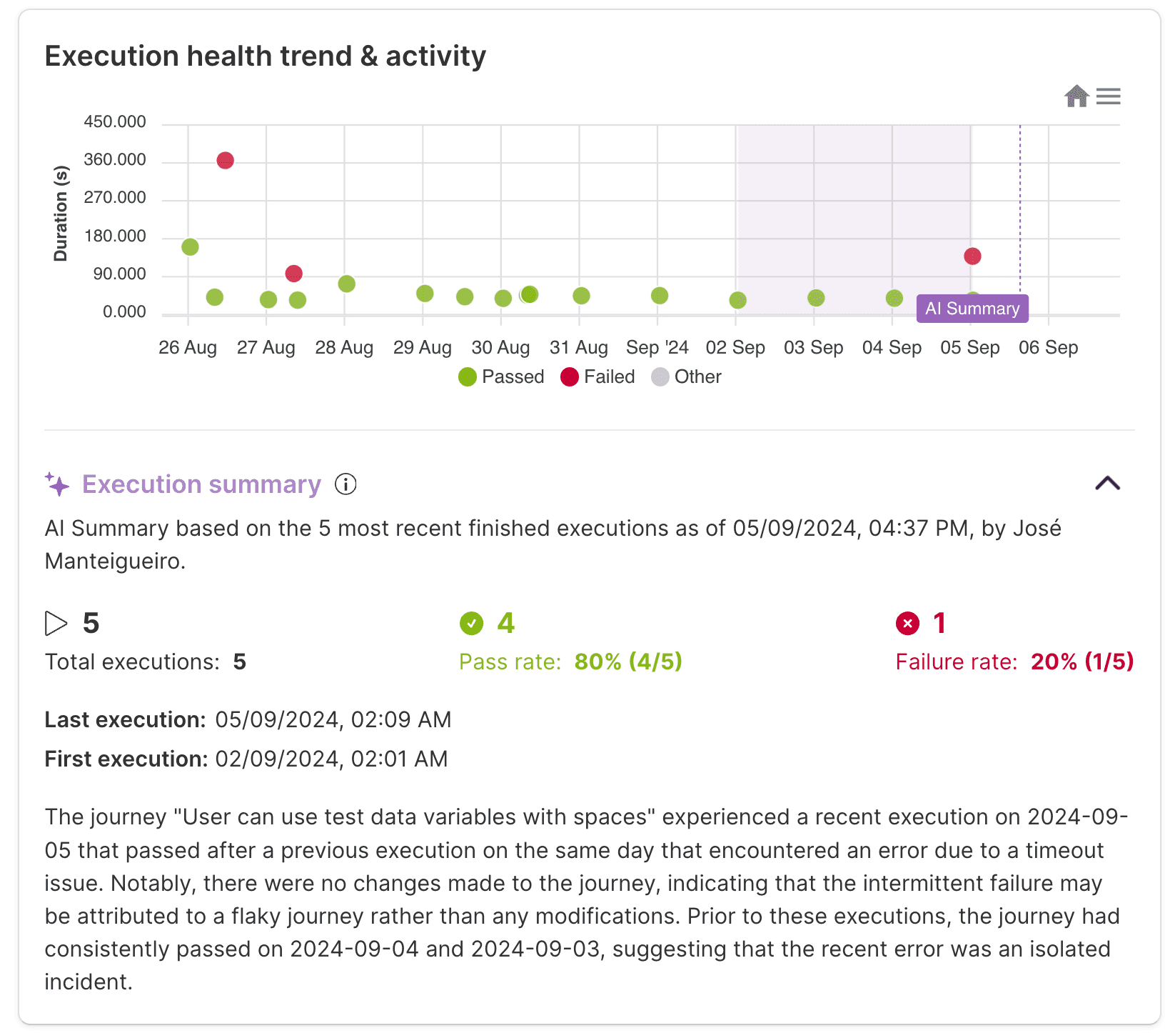
Should there be any newer executions for the journey, you'll encounter a notification indicating that the current summary is outdated. Conveniently, you'll also have the option to generate an updated summary right away.
Skipped, cancelled, or still in progress executions
Only fully finished executions are considered for the analysis. Executions that are still in progress or have been stopped prematurely are not included in the summary.
WARNING
Like any AI-powered feature, there may be instances where things don't go as planned and the summary generation might fail. Should this occur, there will be the option to retry the summarization of the journey, potentially resolving any temporary issues.