# Analytics 2.0 beta
The Analytics 2.0 feature in Virtuoso provides real-time insights into the performance of your tests. Multiple reports are available to help you understand the test execution and the performance of your tests. You can view the reports in the Virtuoso UI and download all the reports in PDF format and individual charts in CSV, Excel, and image format.
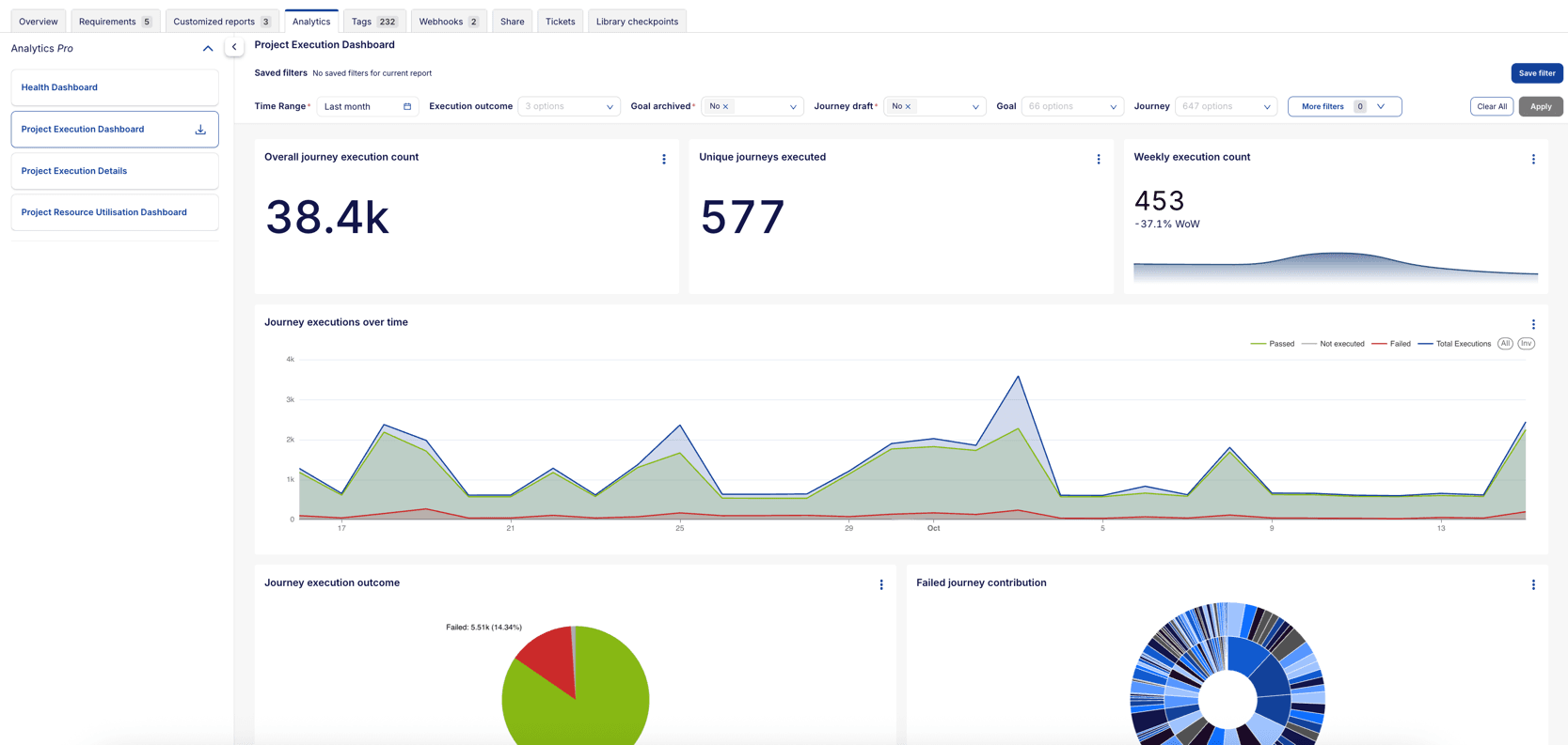
To access the Analytics 2.0 feature, click on the Analytics tab in the Project dashboard in Virtuoso UI.
# Available Reports
# Project dashboards
# 1. Project Execution Dashboard
The Project Execution Dashboard offers a complete view of the test execution status at the project level. It aggregates various key metrics, such as the total number of journey executions, pass/fail rates, execution times, and root cause analysis for failures. This dashboard helps you to evaluate the execution history of your project, monitor trends, and identify problem areas efficiently.

Main Widgets and Reports in the Dashboard:
The dashboard contains several key widgets that help you to monitor project performance. Below are detailed descriptions for each component:
- Overall Journey Execution Count: This widget displays the total number of times journeys have been executed in the project. It's a high-level indicator of how active testing has been within the selected time range.
- Unique Journeys Executed: This metric provides insight into how many unique journeys (test cases) have been executed. It helps you to gauge the diversity of test cases covered within a given time frame.
- Weekly Execution Count: This shows the number of journeys executed in the past week and compares it with the previous week to track the execution trend. This widget can highlight an increase or decrease in testing activity.
- Journey Executions Over Time: This line chart presents the number of journeys executed each day. Different colors represent the outcomes (e.g., passed, failed, skipped), allowing you to identify trends and variations in journey execution over time.
- Journey Execution Outcome (Pie Chart): This pie chart visually displays the proportion of passed, failed, and skipped journeys. It helps you to quickly assess the success rate of the project's test executions.
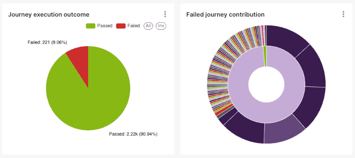
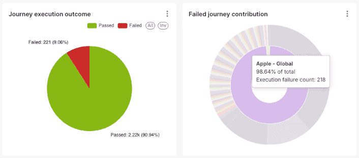
- Failed Journey Contribution (Sunburst Chart): The Failed Journey Contribution (Sunburst Chart) visually breaks down journey failures by goal, allowing you to drill down into specific journeys that failed under each goal.
- Inner Circle: Represents the different goals in the project. Each segment corresponds to a particular goal.
- Outer Segments: Displays the specific journeys that failed under each goal. By hovering over these segments, you can see the failure count and the percentage of failures within that journey.
- Hover Functionality: Hovering over an outer segment highlights a specific journey and shows its failure details, such as the number of failures within that journey, the percentage of total failures it represents, and the contribution of that journey to failures within the associated goal.
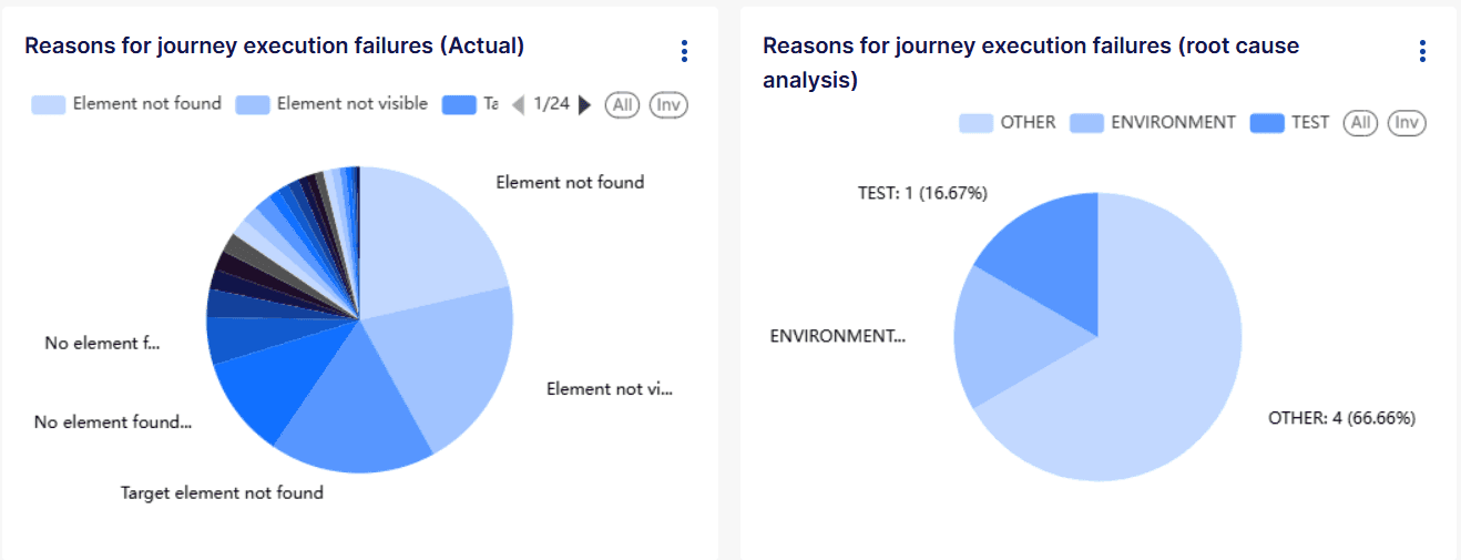
- Reasons for Journey Execution Failures (Actual): This chart analyzes the primary causes of journey execution failures, categorized by the actual failure reason. It helps teams pinpoint specific issues, such as missing elements, script execution errors, or other failures, allowing them to take targeted corrective actions.
- Reasons for Journey Execution Failures (Root cause analysis): Provides an analysis of the causes for failed journey executions, categorized by failure reason from the root cause analysis. This chart can help teams focus on specific areas that need improvement, whether it's a test configuration or infrastructure issue.
- Execution Operating System and Browser/Device: This chart shows which operating systems and browsers were used for journey executions, helping ensure that the tests are being run across the intended environments. It can also highlight any environment-specific issues.
- Execution Bridge: This chart highlights the different execution bridges used in journey runs. It helps teams track bridge utilization and detect potential bridge-specific issues that may impact test execution.

- Execution Outcome Per Month (Raw Data) chart: This bar chart presents a month-by-month breakdown of journey execution outcomes, categorized by passed, failed, and skipped statuses. It provides a historical view of testing trends, allowing you to quickly identify fluctuations or patterns in test performance.
- Journey Execution Outcome Per Month (Percentage): Similar to the previous chart, but shown as percentages, this widget helps you to understand the success rate and how it's changed over time.
- Goal Pass and Fail Rate: This bar chart provides a detailed comparison of pass and fail rates across all test goals within the project. Each bar represents a test goal, color-coded to indicate success (green) and failure (red) rates. The chart helps you to quickly spot underperforming areas that may require further investigation or remediation, while also highlighting goals that are achieving higher success rates.
- Goals Summary (Table): This table offers an interactive view of each goal’s pass, fail, and skip rates, as well as the number of executed journeys. Clicking on a goal filters all related visualizations on the page, giving a detailed, goal-specific breakdown across the project’s key metrics.
- Goal Execution Count: This widget presents a detailed breakdown of how many times each goal within the project has been executed. Each bar represents the total count of executions for a specific goal, helping you quickly identify which goals have received the most focus during testing. The percentage column on the right represents the share of each goal's executions relative to the entire project.
- Sortable columns: The columns (Goal, Count, and Percentage) can be sorted in different ways using the arrows next to the column headers. Sorting can be done alphabetically (for goals) or numerically (for execution count and percentage). This allows you to see the goals in various orders, such as from highest to lowest execution count.
- Cross-filtering: Clicking on a specific goal filters other charts on the page. For instance, selecting "Plans" will filter the rest of the dashboard to show data only related to that goal. This is particularly useful when comparing execution data across different metrics.
Percentage breakdown
This chart displays data at the project level, meaning the percentage breakdown is based on the overall executions within the project. For example, "Apple - Global" executions account for 96.433% of the total journey executions in the Apple docs project.
- Team Member Execution Count: One of the most interesting features is how the Team Member Execution Count chart below interacts with this table. When you click on a specific goal in the Goal Execution Count chart, the Team Member Execution Count chart below dynamically updates to show who has executed journeys within that selected goal. This gives you insights into which team members are most active in testing particular goals, revealing data that would otherwise remain hidden.
# 2. Execution Details
The Execution Details Report allows you to view detailed insights into the execution of test journeys. This feature enables you to analyze the performance of test journeys, track execution outcomes, and take appropriate actions such as rerunning failed journeys.
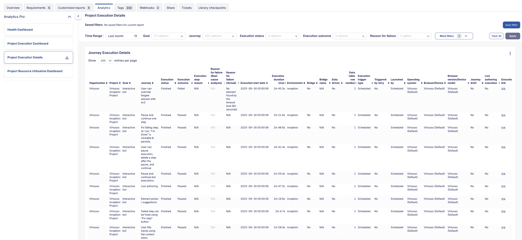 Main Widgets and Reports in the Dashboard:
The dashboard contains tables that help you to monitor your project's performance. Below are detailed descriptions for each component:
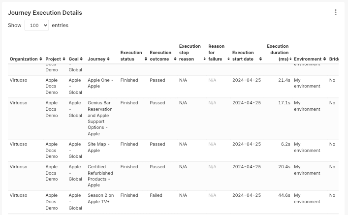
Journey Execution Details Table: Provides comprehensive details on each journey execution, including the execution date, outcome, user actions, and additional metadata. This table enables you to perform in-depth analysis of specific executions, facilitating troubleshooting and performance assessment. Additionally, it allows users to identify live authoring executions.
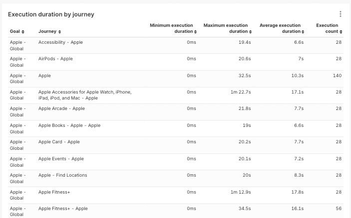
Execution Duration by Journey: Offers a detailed breakdown of journey execution times, showing the minimum, maximum, and average durations. This table allows you to assess performance consistency and identify potential outliers or performance bottlenecks across different test journeys.This table includes fields like Execution Status, Journey Name, Execution Outcome, and Execution Duration.
# 3. Health Dashboard
The Health Dashboard offers a real-time overview of your testing platform's stability by displaying the most recent execution status of each journey within your project. This dashboard helps you quickly assess the current health of your testing environment, allowing you to identify any journeys that may be experiencing issues.
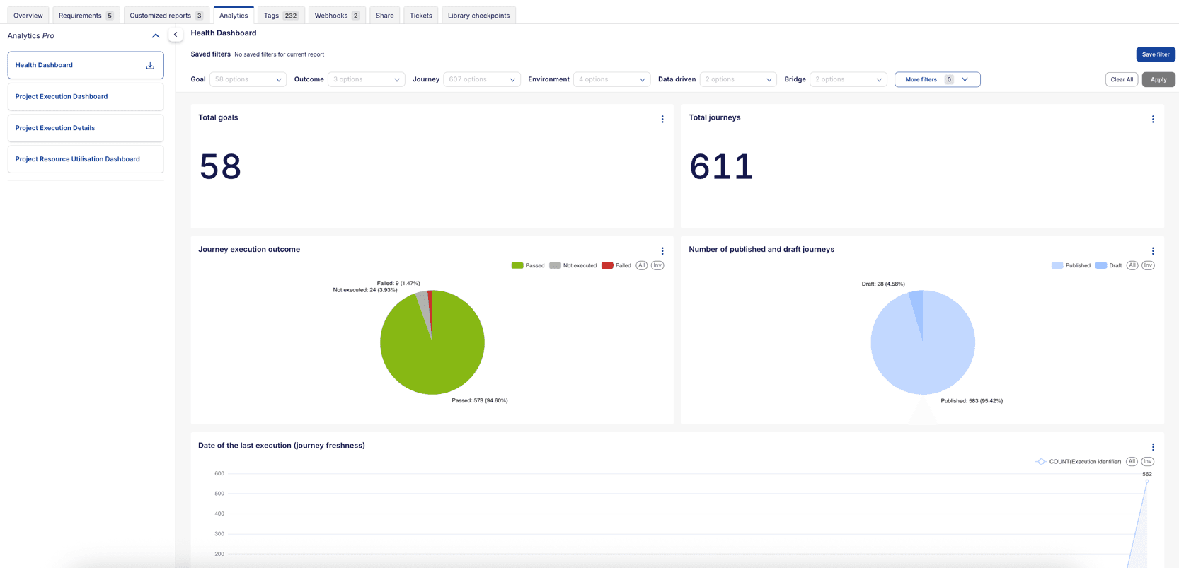
Main Widgets and Reports in the Dashboard:
- Total goals: Displays the total number of goals in the project, providing a quick overview of the project's scope.
- Total journeys: Shows the total number of journeys in the project, offering insight into the complexity and coverage of the project.
- Journey execution outcome: Summarizes the latest execution status for all journeys (Passed, Failed, or Not Executed), offering a high-level view of testing health.
- Number of published and draft journeys: Displays the proportion of published and draft journeys in the project, helping you track the progress of test development.
- Date of the last execution (journey freshness): The Date of the Last Execution chart provides insights into journey freshness by showing when each journey in your project was most recently executed. This line chart helps you identify how current your test execution data is and whether journeys are being run regularly. This chart helps teams maintain an active and current test suite by highlighting execution patterns and identifying journeys that may need more frequent execution.
- Failed journey contribution: A breakdown of failed journeys and their contributions (percentage and count) to both the project-level execution failure count and goal-specific execution failure count. The outer ring segments represent specific failed journeys. The inner ring segments indicate the different goals associated with each journey.
- Reason for failure (automated): This chart categorizes the reasons for journey execution failures based on automated analysis.
- Reason for failure (user-selected): This chart categorizes the reasons for journey execution failures based on user-selected failure reasons entered by team members.

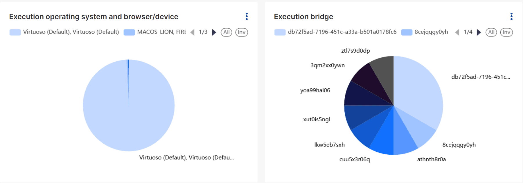
- Execution operating system and browser/device: Shows the proportion of operating systems and browsers/devices used for the latest journey executions.
- Execution bridge: Displays the proportion of execution bridges used for the latest journey executions, helping detect any bridge-related instability or bottlenecks.
- Execution trigger type: This bar chart shows the breakdown between manual and scheduled executions, with color coding to indicate execution outcomes (Passed, Failed, Not executed). It helps you understand the balance between automated testing and manual intervention in your testing process.
- Execution environment: This chart provides insights into the environments where journeys were executed. It helps you track where tests are being run and identify any environment-specific issues.
- Team member execution count: This chart shows the number of journeys executed by each team member, helping you understand team engagement and contribution to testing efforts.
- Goal summary: A table summarizing each goal’s execution performance — including the number of passed, failed, and not executed journeys.
- Latest status of each goal: Provides a snapshot of each goal’s most recent execution results to track progress across testing objectives.

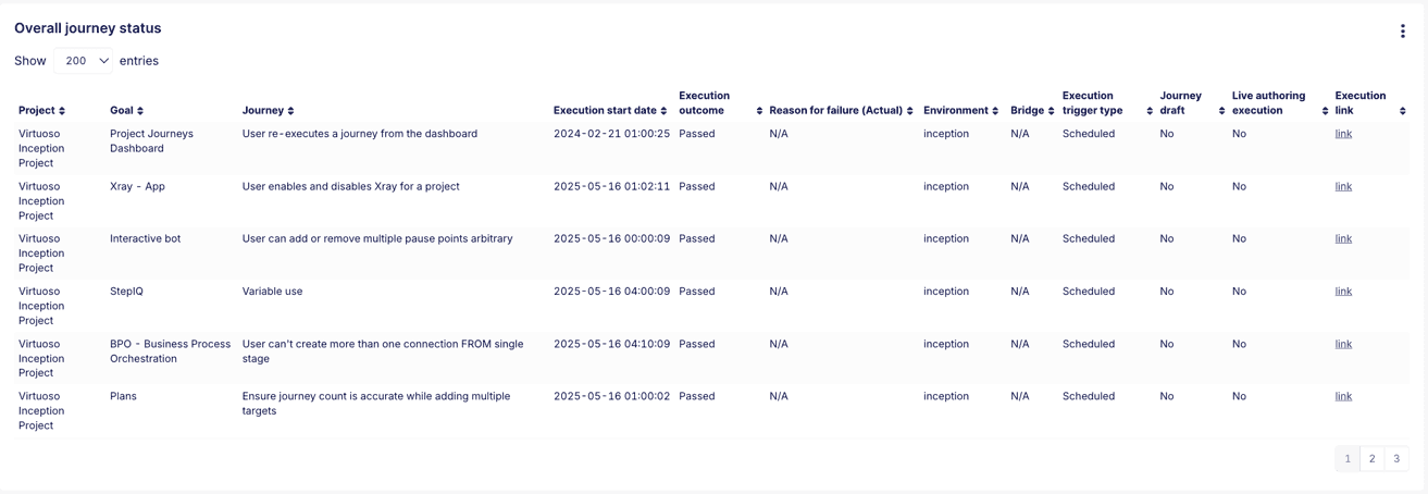
- Overall journey status: A detailed table showing the current state of each journey, including the latest execution details.
# 4. Project Resource Utilization Dashboard
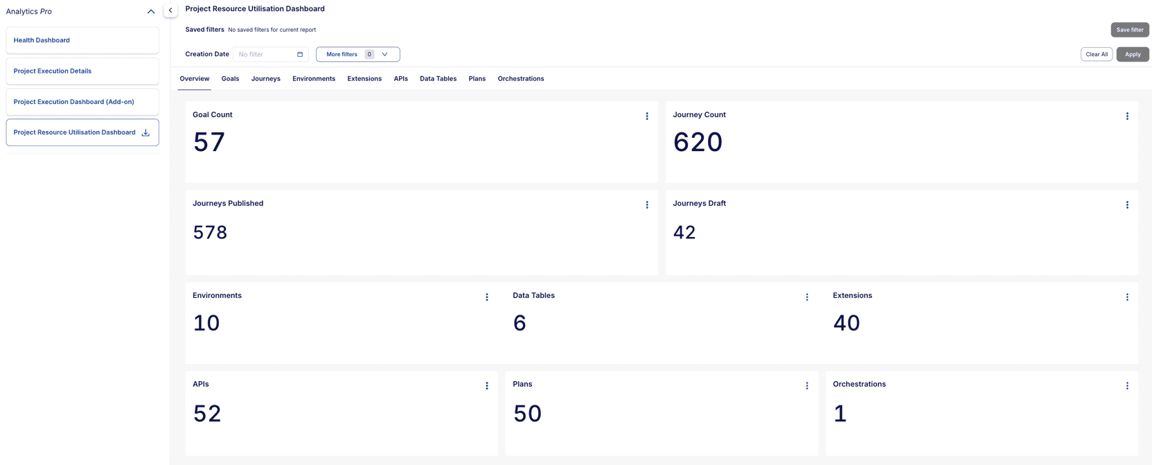
The Project Resource Utilization Dashboard provides a centralized view of all key resources within a Virtuoso project. It enables users to quickly assess the quantity and status of resources such as goals, journeys (published and draft), environments, extensions, APIs, data tables, and bridges.
Main Widgets and Reports in the Dashboard:
The dashboard contains several key widgets that help you to monitor project resource usage. Below are detailed descriptions for each component:
- Goal Count: Displays the total number of goals in your project, providing a quick overview of your testing objectives and project scope.
- Journey Count: Shows the complete count of journeys in your project, offering insight into the overall test coverage and complexity.
- Journeys Published: Indicates the number of journeys that are published and ready for execution, helping you track production-ready test cases.
- Journeys Draft: Displays the count of journeys still in draft status, allowing you to monitor test development progress and identify pending work.
- Environments: Shows the number of configured environments in your project, helping you understand your testing environment configured across the projects.
- Data Tables: Shows the count of data tables in use, offering visibility into your test data management.
- Extensions: Displays the count of extensions being created in your project, providing insights into custom scripts.
- APIs: Presents the number of API resources configured, helping you track external service integrations and dependencies.
- Plans: Presents the number of plan resources configured, helping you track test planners.
- Orchestrations: Displays the count of orchestrations being utilized in your project, providing insights into custom workflows and integrations.
Detailed Metrics for Each Resource Type:
The dashboard includes detailed metrics for each resource type as a separate tab. These tabs provide in-depth information about each resource, including creation dates, creators, and direct access links.
- Goals Tab: Provides a detailed table view of all goals in your project, including goal name, creator, creation date, and direct access links. This table enables you to quickly navigate to specific goals and understand goal ownership.
- Journeys Tab: Offers comprehensive details about all journeys, including their status (published/draft), creator information, creation and modification dates, and quick access links for editing or execution.
- Environments Tab: Lists all configured environments with their details, helping you manage and track your testing environments effectively.
- Extensions Tab: Displays detailed information about all extensions created, including name, creator, creation date, and direct access links.
- APIs Tab: Provides a complete overview of all API integrations, including name, creator, creation date, and direct access links.
- Data Tables Tab: Shows comprehensive information about all data tables, including name, creator, creation date, and direct access links.
- Plans Tab: Lists all plans with their configuration details, status, and more metrics.
- Orchestrations Tab: Lists all orchestrations with their configuration details, status, and more metrics.
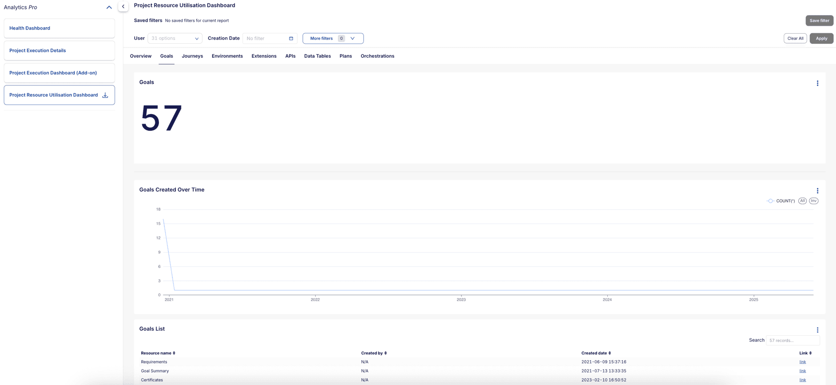
For example, Goals tab
Main Widgets and Reports in the Goals Tab:
- Goals: Displays the total number of goals in your project.
- Goals created over time: This line chart presents the creation patterns of goals over time. It helps you to identify periods of high development activity and understand project growth patterns, enabling better resource planning and team allocation.
- Goals List: A detailed table view of all goals in your project, including goal name, creator, creation date, and direct access links. This table enables you to quickly navigate to specific goals and understand goal ownership.

- Goal Creation User Distribution: This chart shows the distribution of goal creation among different users in your project. It helps you to identify the most active contributors and understand team dynamics.
# Organization dashboards
# 1. Organization Execution Dashboard
The Organization Execution Dashboard provides a high-level overview of test execution across all projects within your organization. It aggregates key metrics, such as total journey executions, pass/fail rates, and execution trends, allowing you to monitor the overall health and performance of testing activities across multiple projects.
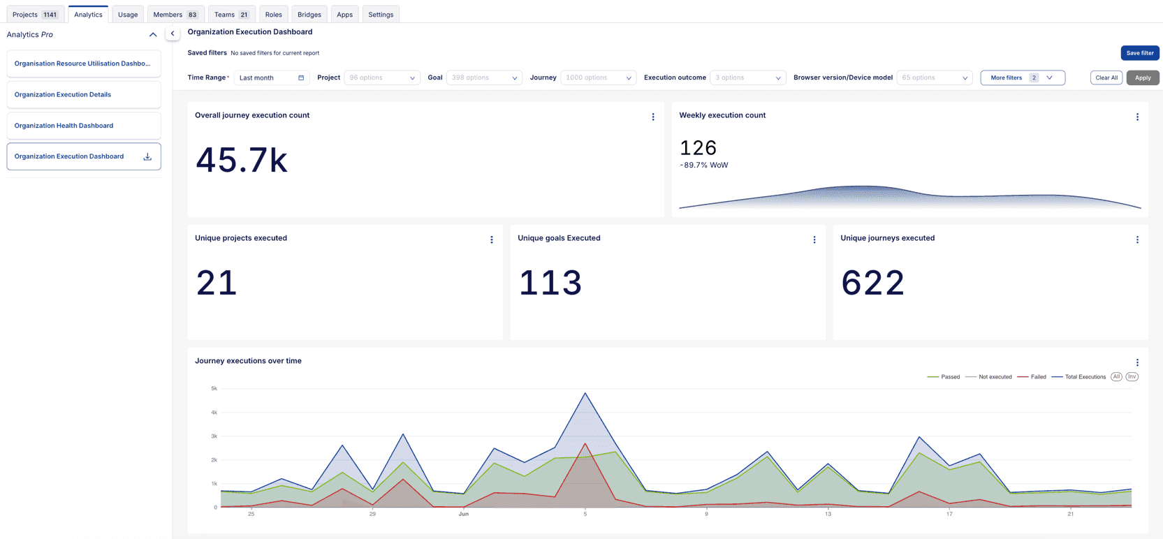
Main Widgets and Reports in the Dashboard:
Overall journey execution count: Displays the total number of journey executions across all projects in the organization, providing a quick snapshot of testing activity.
Weekly execution count: Shows the number of journeys executed in the past week across all projects and compares it with the previous week to track trends in testing activity.
Unique projects executed: This metric provides insight into how many unique projects have had journeys executed, helping you gauge the breadth of testing coverage across the organization.
Unique goals executed: This metric shows the number of unique goals that have been executed across all projects, providing insight into the diversity of testing objectives being covered.
Unique journeys executed: This metric indicates how many unique journeys (test cases) have been executed across all projects, helping you to understand the variety of test cases being covered within the organization.
Journey executions over time: This line chart presents the number of journeys executed each day across all projects. Different colors represent the outcomes (e.g., passed, failed, skipped), allowing you to identify trends and variations in journey execution over time.
Journey execution outcome: This pie chart visually displays the proportion of passed, failed, and skipped journeys across all projects. It helps you to quickly assess the overall success rate of testing activities within the organization.
Failed journey contribution: The Failed Journey Contribution (Sunburst Chart) visually breaks down journey failures by project, allowing you to drill down into specific projects that have failed journeys.
- Inner circle: Represents the different projects in the organization. Each segment corresponds to a particular project.
- Outer segments: Displays the specific journeys that failed under each project. By hovering over these segments, you can see the failure count and the percentage of failures within that journey.
- Hover functionality: Hovering over an outer segment highlights a specific journey and shows its failure details, such as the number of failures within that journey, the percentage of total failures it represents, and the contribution of that journey to failures within the associated project.

Reason for failure (automated): This chart analyzes the primary causes of journey execution failures across all projects, categorized by the actual failure reason. It helps teams pinpoint specific issues, such as missing elements, script execution errors, or other failures, allowing them to take targeted corrective actions.
Reason for failure (user-selected): This chart categorizes the reasons for journey execution failures across all projects based on user-selected failure reasons entered by team members.

Execution operating system and browser/device: This chart shows which operating systems and browsers were used for journey executions across all projects, helping ensure that the tests are being run across the intended environments. It can also highlight any environment-specific issues.
Execution bridge: This chart highlights the different execution bridges used in journey runs across all projects. It helps teams track bridge utilization and detect potential bridge-specific issues that may impact test execution.
Execution outcome per month (raw data): This bar chart presents a month-by-month breakdown of journey execution outcomes across all projects, categorized by passed, failed, and skipped statuses. It provides a historical view of testing trends, allowing you to quickly identify fluctuations or patterns in test performance.
Journey execution outcome per month (percentage): Similar to the previous chart, but shown as percentages, this widget helps you to understand the success rate and how it's changed over time.
Project Pass/Fail rate: This bar chart provides a detailed comparison of pass and fail rates across all projects within the organization. Each bar represents a project, color-coded to indicate success (green) and failure (red) rates. The chart helps you to quickly spot underperforming projects that may require further investigation or remediation, while also highlighting projects that are achieving higher success rates.

Project summary (Table): This table offers an interactive view of each project's pass, fail, and skip rates, as well as the number of executed journeys. Clicking on a project filters all related visualizations on the page, giving a detailed, project-specific breakdown across the organization’s key metrics.
Project execution count: This widget presents a detailed breakdown of how many times each project within the organization has been executed. Each bar represents the total count of executions for a specific project, helping you quickly identify which projects have received the most focus during testing. The percentage column on the right represents the share of each project's executions relative to the entire organization.

Team member execution count: One of the most interesting features is how the Team Member Execution Count chart below interacts with this table. When you click on a specific project in the Project Execution Count chart, the Team Member Execution Count chart below dynamically updates to show who has executed journeys within that selected project. This gives you insights into which team members are most active in testing particular projects, revealing data that would otherwise remain hidden.

# 2. Organization Execution Details
The Organization Execution Details Report allows you to view detailed insights into the execution of test journeys across all projects in your organization. This feature enables you to analyze the performance of test journeys, track execution outcomes, and take appropriate actions such as rerunning failed journeys.
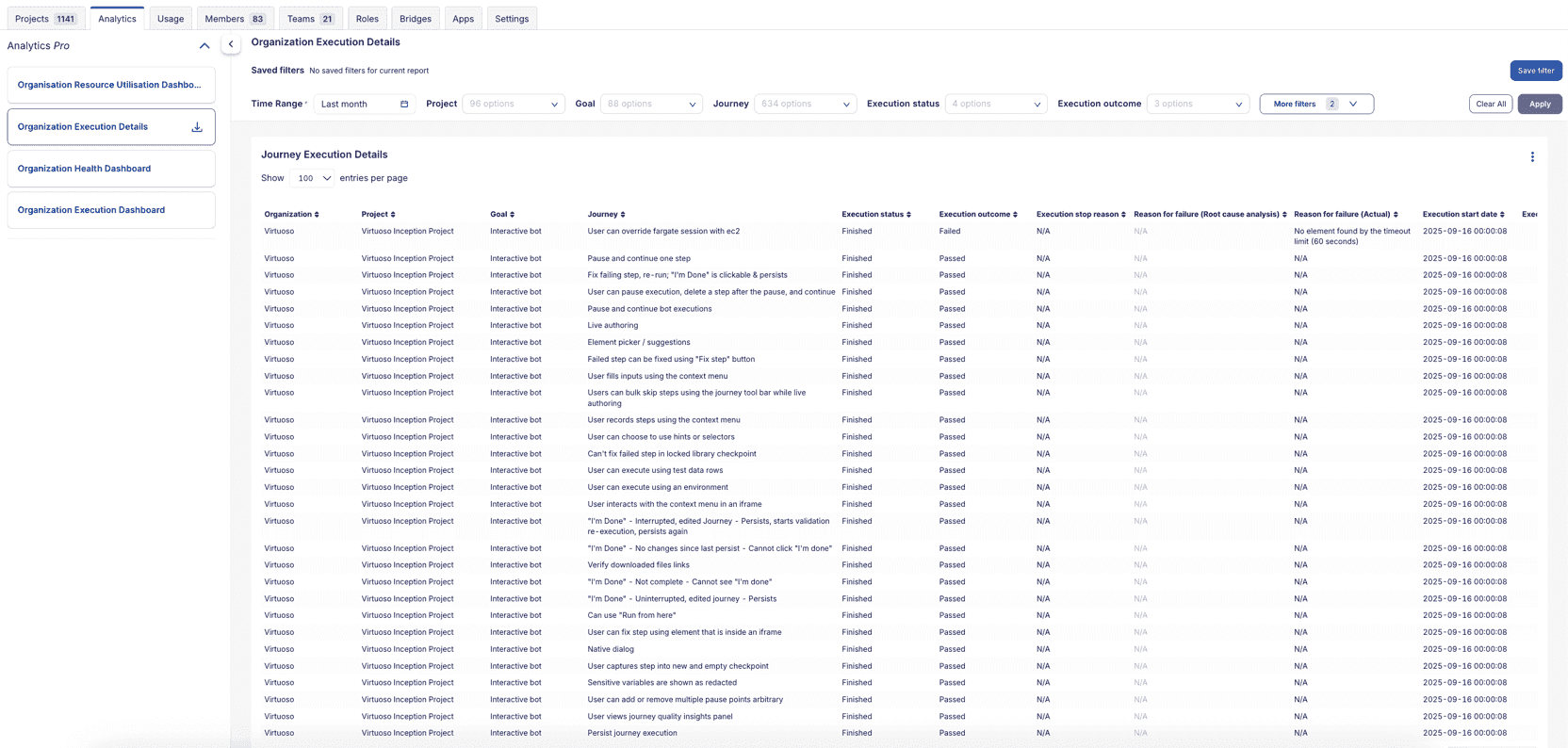
Main Widgets and Reports in the Dashboard:
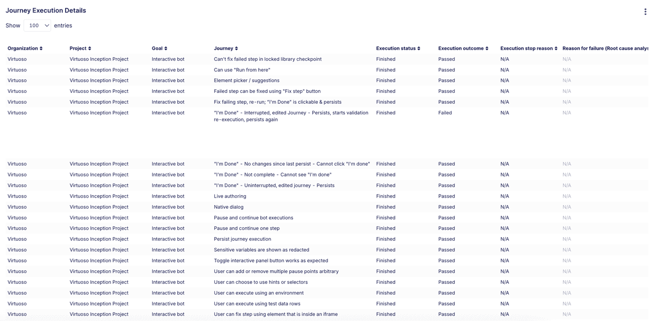
Journey execution details table: Provides comprehensive details on each journey execution across all projects, including the execution date, outcome, user actions, and additional metadata. This table enables you to perform in-depth analysis of specific executions, facilitating troubleshooting and performance assessment.
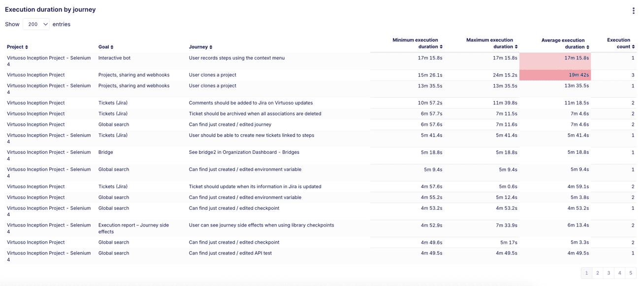
Execution duration by journey: Offers a detailed breakdown of journey execution times across all projects, showing the minimum, maximum, and average durations. This table allows you to assess performance consistency and identify potential outliers or performance bottlenecks across different test journeys.
# 3. Organization Health Dashboard
The Organization Health Dashboard provides a real-time overview of the health of your testing platform across all projects in your organization. It displays the most recent execution status of each journey, allowing you to quickly assess the current health of testing activities and identify any journeys that may be experiencing issues.
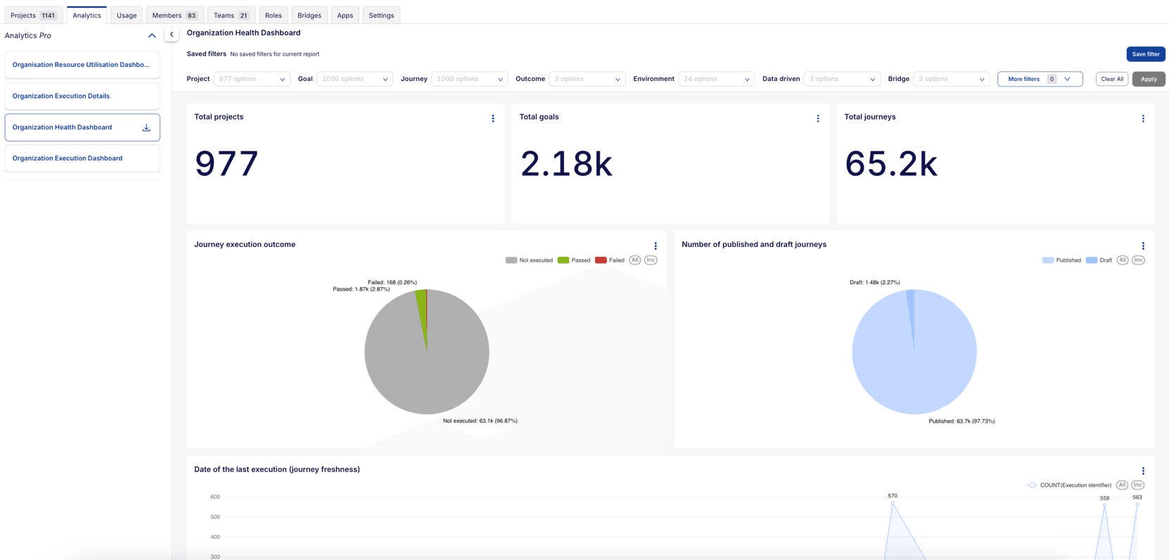
Main Widgets and Reports in the Dashboard:
Total projects: Displays the total number of projects in the organization, providing a quick overview of the organization's scope.
Total goals: Shows the total number of goals across all projects, offering insight into the complexity and coverage of testing objectives.
Total journeys: Displays the total number of journeys across all projects, helping you to understand the variety of test cases being covered within the organization.
Journey execution outcome: Summarizes the latest execution status for all journeys across all projects (Passed, Failed, or Not Executed), offering a high-level view of testing health.
Number of published and draft journeys: Displays the proportion of published and draft journeys across all projects, helping you track the progress of test development.
Date of the last execution (journey freshness): The Date of the Last Execution chart provides insights into journey freshness by showing when each journey in your organization was most recently executed. This line chart helps you identify how current your test execution data is and whether journeys are being run regularly. This chart helps teams maintain an active and current test suite by highlighting execution patterns and identifying journeys that may need more frequent execution.
Failed journey contribution: A breakdown of failed journeys and their contributions (percentage and count) to both the organization-level execution failure count and project-specific execution failure count. The outer ring segments represent specific failed journeys. The inner ring segments indicate the different projects associated with each journey.

Reason for failure (automated): This chart categorizes the reasons for journey execution failures across all projects based on automated analysis.
Reason for failure (user-selected): This chart categorizes the reasons for journey execution failures across all projects based on user-selected failure reasons entered by team members.

Execution operating system and browser/device: This chart shows the proportion of operating systems and browsers/devices used for the latest journey executions across all projects, helping ensure that the tests are being run across the intended environments. It can also highlight any environment-specific issues.
Execution bridge: Displays the proportion of execution bridges used for the latest journey executions across all projects, helping detect any bridge-related instability or bottlenecks.
Execution trigger type: This bar chart shows the breakdown between manual and scheduled executions across all projects, with color coding to indicate execution outcomes (Passed, Failed, Not executed). It helps you understand the balance between automated testing and manual intervention in your testing process.
Execution environment: This chart provides insights into the environments where journeys were executed across all projects. It helps you track where tests are being run and identify any environment-specific issues.
Team member execution count: This chart shows the number of journeys executed by each team member across all projects, helping you understand team engagement and contribution to testing efforts.

Project summary: A table summarizing each project's execution performance — including the number of passed, failed, and not executed journeys.
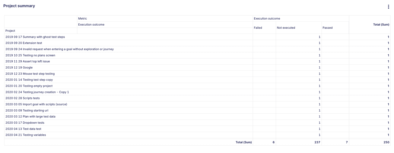
Latest status of each project: Provides a snapshot of each project's most recent execution results to track progress across testing objectives.
Latest journey execution details: A detailed table showing the current state of each journey across all projects, including the latest execution details.
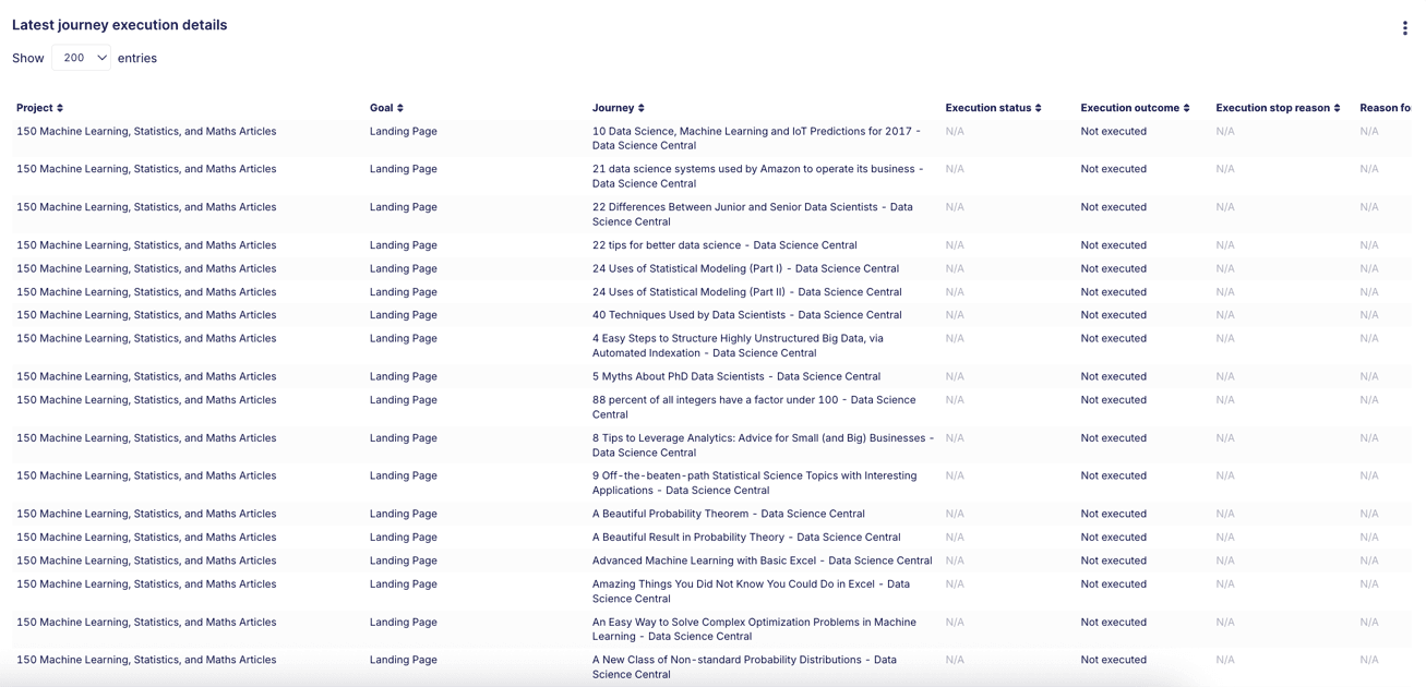
Latest execution data
- Availability: Latest execution details are available starting from 1st May 2025.
- Not Executed status: If a journey hasn't been executed since 1st May 2025, its status will appear as
Not executed. - Restored goals: When a goal is restored after being archived, all journeys under that goal will initially show
Not executeduntil they are executed again. - Journey changes: For journeys modified before 30th May 2025, the system will display the most recent execution data (if available). If no executions have occurred since the modification, it will show
Not executed.
# 4. Organization Resource Utilization Dashboard
The Organization Resource Utilization Dashboard provides a centralized view of all key resources across all projects within your organization. It enables users to quickly assess the quantity and status of resources such as goals, journeys, environments, extensions, APIs, data tables, bridges, plans, and orchestrations.
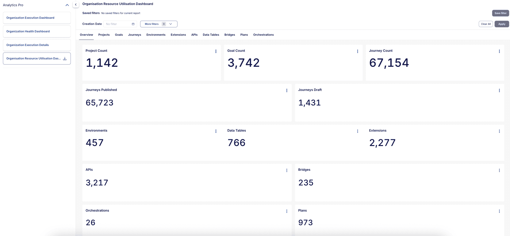
Main Widgets and Reports in the Dashboard:
The dashboard contains several key widgets that help you to monitor resource usage across all projects in your organization. Below are detailed descriptions for each component:
- Project Count: Displays the total number of projects in your organization, providing a quick overview of the organization's scope.
- Goal Count: Displays the total number of goals across all projects, providing a quick overview of testing objectives and project scope.
- Journey Count: Shows the complete count of journeys across all projects, offering insight into the overall test coverage and complexity.
- Journeys Published: Indicates the number of journeys that are published and ready for execution across all projects, helping you track production-ready test cases.
- Journeys Draft: Displays the count of journeys still in draft status across all projects, allowing you to monitor test development progress and identify pending work.
- Environments: Shows the number of configured environments across all projects, helping you understand the testing environments configured.
- Data Tables: Shows the count of data tables in use across all projects, offering visibility into test data management.
- Extensions: Displays the count of extensions being created across all projects, providing insights into custom scripts.
- APIs: Presents the number of API resources configured across all projects, helping you track external service integrations and dependencies.
- Bridges: Displays information about execution bridges available across all projects, helping you monitor your test execution infrastructure.
- Orchestrations: Displays the count of orchestrations being configured across all projects, providing insights into custom workflows.
- Plans: Presents the number of plan resources configured across all projects, helping you track test execution planners.
Detailed Metrics for Each Resource Type:
The dashboard includes detailed metrics for each resource type as a separate tab. These tabs provide in-depth information about each resource, including creation dates, creators, and direct access links.
- Projects Tab: Provides a detailed table view of all projects in your organization, including project name, creator, creation date, and direct access links. This table enables you to quickly navigate to specific projects and understand project ownership.
- Goals Tab: Provides a detailed table view of all goals across all projects, including goal name, creator, creation date, and direct access links. This table enables you to quickly navigate to specific goals and understand goal ownership.
- Journeys Tab: Offers comprehensive details about all journeys across all projects, including their status (published/draft), creator information, creation dates, and quick access links for editing or execution.
- Environments Tab: Lists all configured environments across all projects with their details, helping you manage and track your testing environments effectively.
- Extensions Tab: Displays detailed information about all extensions created across all projects, including their name, creator, creation dates, and direct access links.
- APIs Tab: Provides a complete overview of all API integrations across all projects, including various details like name, creator, creation dates, and direct access links.
- Data Tables Tab: Shows comprehensive information about all data tables across all projects, including name, creator, creation dates, and direct access links.
- Bridges Tab: Lists all execution bridges across all projects with their configuration details, status, and more metrics.
- Plans Tab: Lists all plans across all projects with their configuration details, status, and more metrics.
- Orchestrations Tab: Lists all orchestrations across all projects with their configuration details, status, and more metrics.
For example, Projects tab
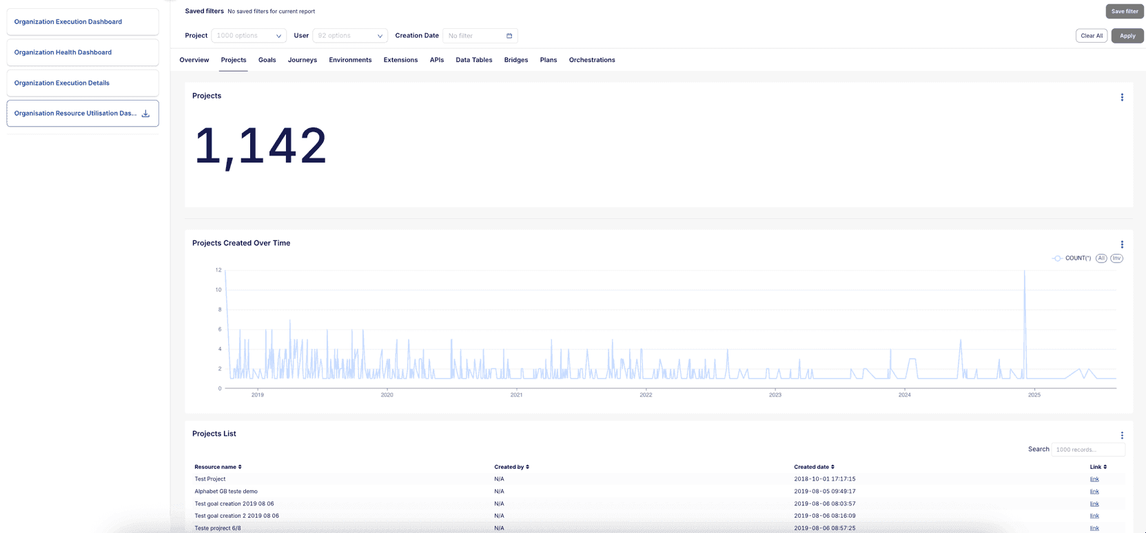
Main Widgets and Reports in the Projects Tab:
- Projects: Displays the total number of projects in your organization.
- Projects created over time: This line chart presents the creation patterns of projects over time. It helps you to identify periods of high development activity and understand organization growth patterns, enabling better resource planning and team allocation.

- Projects List: A detailed table view of all projects in your organization, including project name, creator, creation date, and direct access links. This table enables you to quickly navigate to specific projects and understand project ownership.

- Project Creation User Distribution: This chart shows the distribution of project creation among different users in your organization. It helps you to identify the most active contributors and understand team dynamics.

# Filter Options
The available reports offer various filtering options, allowing you to refine the data presented. These filters include, but are not limited to, the following:
- Time Range (Last day, week, month, quarter, or year): This enables the user to adjust the reporting period and see data for the selected time frame.
- Execution Outcome (Pass, Fail, Skipped): You can choose to focus on executions with specific outcomes.
- Goal archived and Journey draft options: Filters help narrow down the displayed goals and journeys based on their archived status or whether they are still in draft mode.
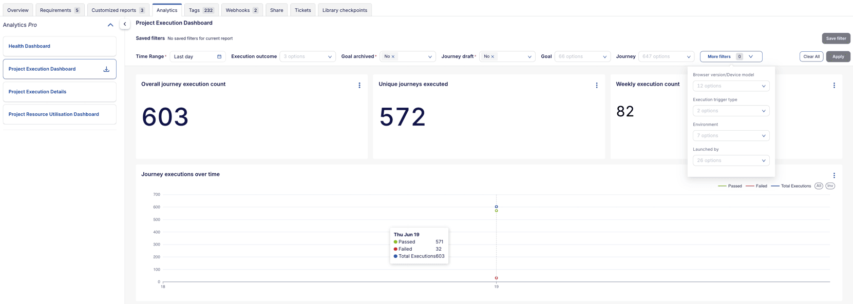
# Saved filters
You can save your filter configurations for future use. This feature allows you to quickly access your preferred filter settings without having to reconfigure them each time you access the report.
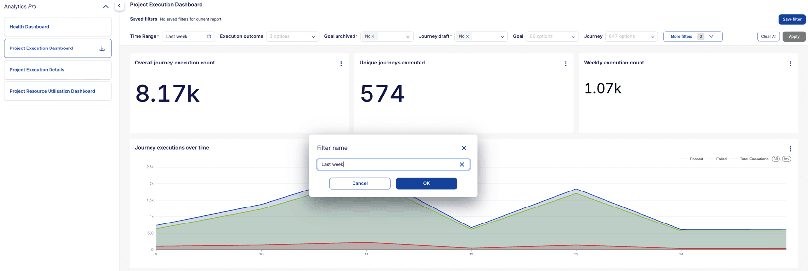
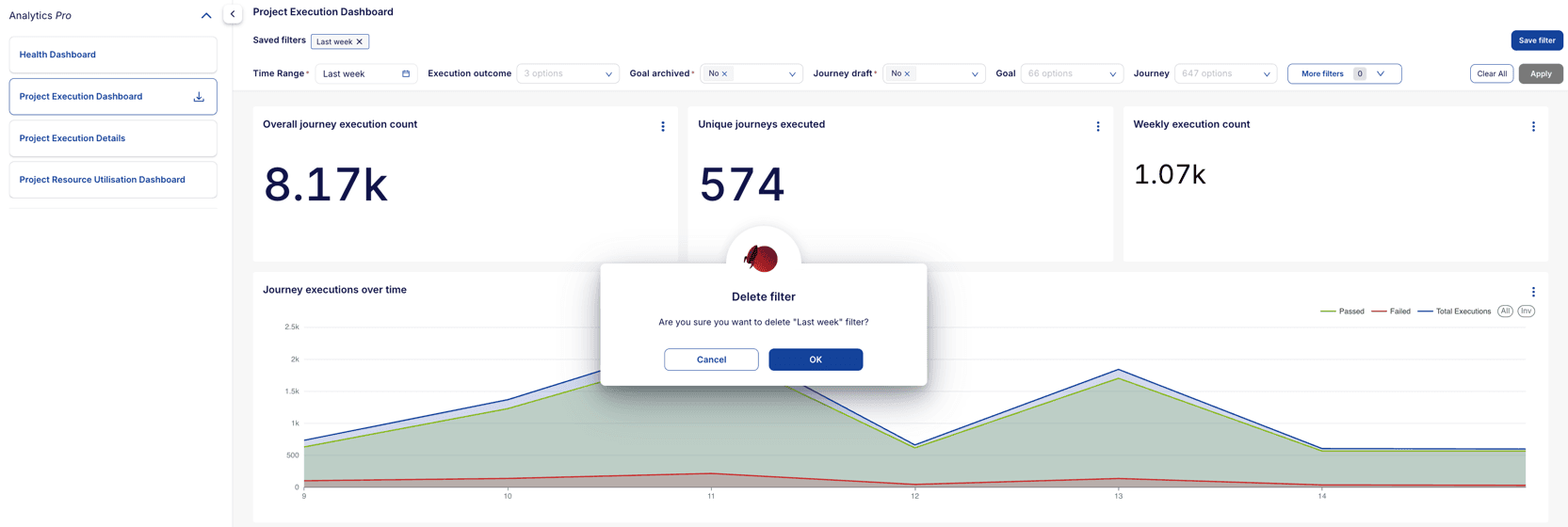
To save a filter, apply the desired filters on your dashboard and click on the Save Filter button, enter a name for the filter, and click Save.
To apply a saved filter, click on one of the filter labels shown in the saved filters section. After a filter is applied, the filter will be highlighted in a blue colored border.
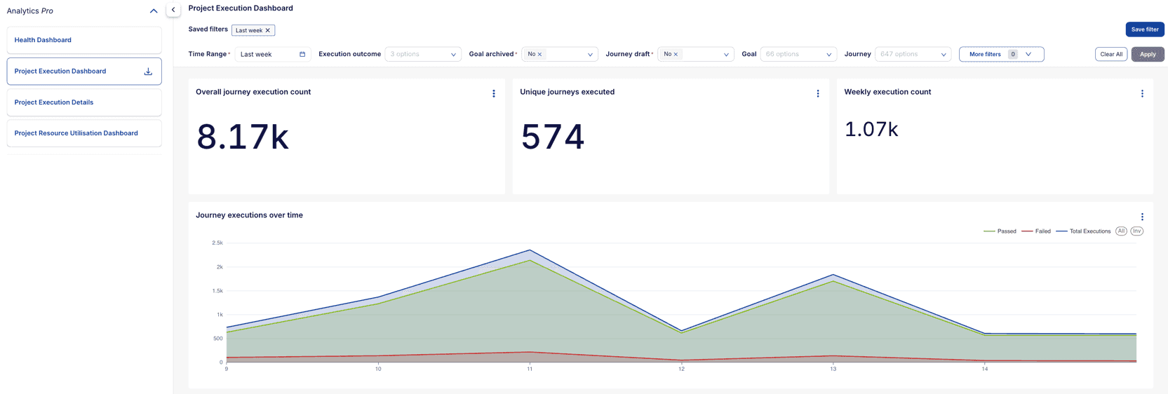
To remove a saved filter, click on the x icon on the filter label.
Note
The saved filters are available only for the user who created them. Other users will not be able to see or access the saved filters. The filters are saved by project and are available only for the project in which they were created.
# Report Download Options
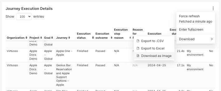
You can export any of the charts or tables into formats such as CSV, Excel, or Image. The PDF of the entire report can also be downloaded using the download button present beside the name of the report in the left panel.
Chart/Widget Download: Click on the three dots present on the top right corner of the chart and select the desired format to download the chart.
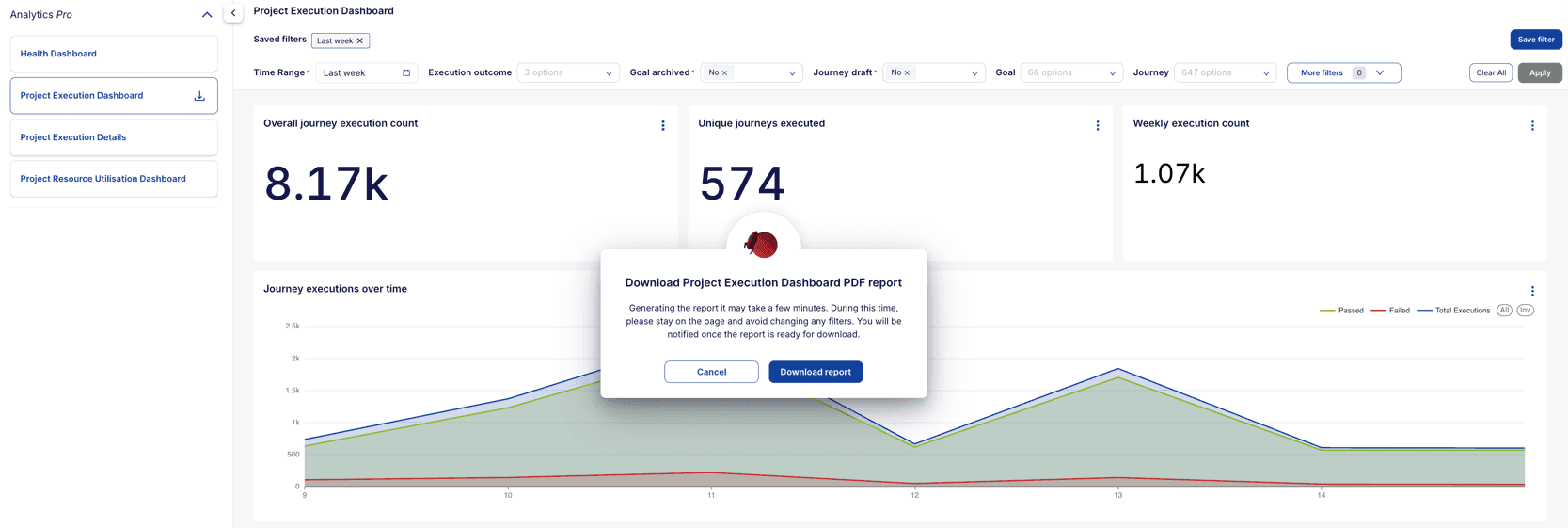
Entire Report Download: Click on the download button present beside the name of the report in the left panel to download the entire report in PDF format.
Note
The processing of the entire report download may take some time depending on the data and length of the report. Please wait for the download to complete. Do not refresh the page or navigate to other pages during the download process.
# Important Points to Note
- Live Authoring Executions: Executions triggered via the "I'm done" button during live authoring journeys are reflected in dashboards for executions starting March 5, 2025.
- Reason for Failure (Actual) Data for Reason for Failure (Actual) is available from March 6, 2025.
- Bridge Name Data for Bridge Name is available from January 21, 2025.
- Active Goal and Published Journey in Historical Executions: Historical execution data assumes that each execution was executed as an active goal and a published journey. This applies only to historical data, not to new executions, the new executions account for the goal being archived and an journey being draft.