
# The new journey list experience
The new journey list experience is a redesign of how journeys are presented in the Goal view. It keeps everything you can already do in the classic (legacy) journey list, but changes how those actions are surfaced: journeys now appear in a full-width, sortable table, the goal summary moves into an on-demand slide-out panel, and a new quick look pane lets you inspect any journey without leaving the list.
The new experience is being rolled out gradually to organizations. When it is enabled for you, it applies automatically whenever you open a goal — there is nothing to switch on.
# What's different
# A table built for scanning
In the classic experience, journeys are shown as a stack of cards in a narrow left-hand panel, with the goal summary taking up the rest of the screen. The new experience gives the journey list the full width of the page and lays every journey out as a row in a table with the following columns:
- Journey — the journey's name, along with its draft indicator, AI summary, and tags.
- Assignee — who the journey is assigned to (shown when journey assignment is available in your organization).
- Lifecycle status — the journey's lifecycle stage (shown when your project has lifecycle stages configured).
- Health — the journey's recent pass rate at a glance, with a mini trend chart.
- Last execution — when the journey last ran and how it went.
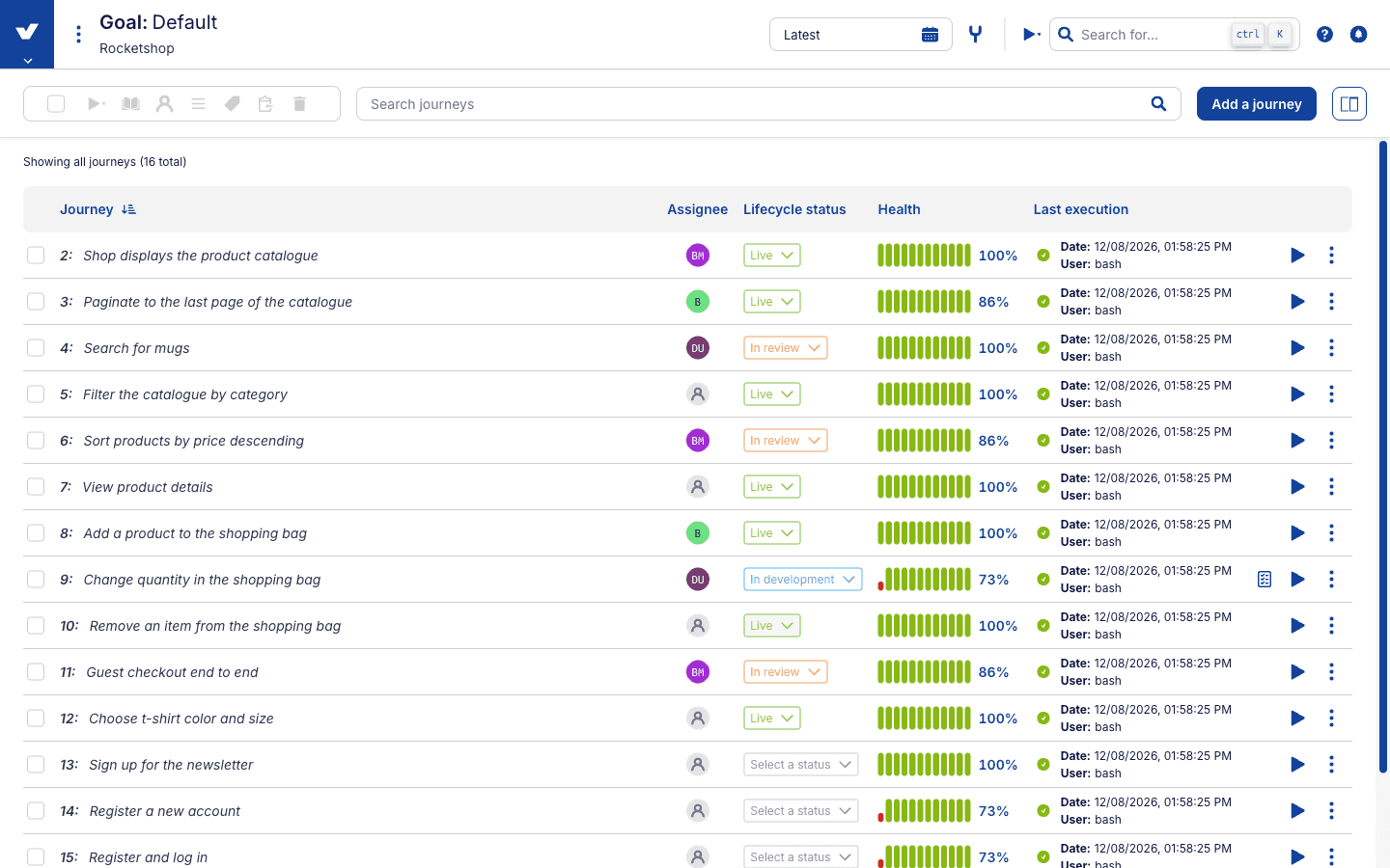
Click any column header to sort by that column; click it again to reverse the order. Sorting by Health or Last execution is the fastest way to surface the journeys that need attention right now. A line above the table always tells you how many journeys you're looking at, including how many are matched by your search and how many are selected.
# One toolbar for everything
The toolbar above the table brings together actions that were previously spread across the page:
- Search journeys by name or tag — the search box now lives in the toolbar rather than in a separate header.
- Select journeys with the checkbox on each row (or the select-all checkbox in the toolbar), then act on the whole selection at once: execute (with or without advanced options), publish or unpublish, assign to a teammate, set a lifecycle stage, tag, copy, or delete.
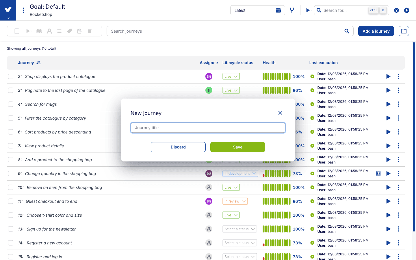
- Add journey opens a dialog for creating a new journey. This replaces the classic "add journey" card at the bottom of the list, so you no longer need to scroll to create a journey. New journey from here on a checkpoint opens the same dialog with the starting point pre-filled.
- The summary panel button on the right of the toolbar opens the goal summary (see below).
# The goal summary, on demand
Classic shows the goal Summary and Timeline tabs beside the journey list at all times. In the new experience the journey table gets that space instead, and the summary opens as a slide-out panel over the right-hand side of the page whenever you want it — click the panel button in the toolbar to open it, and close it when you're done. Everything in the panel works exactly as before, including switching between its tabs.
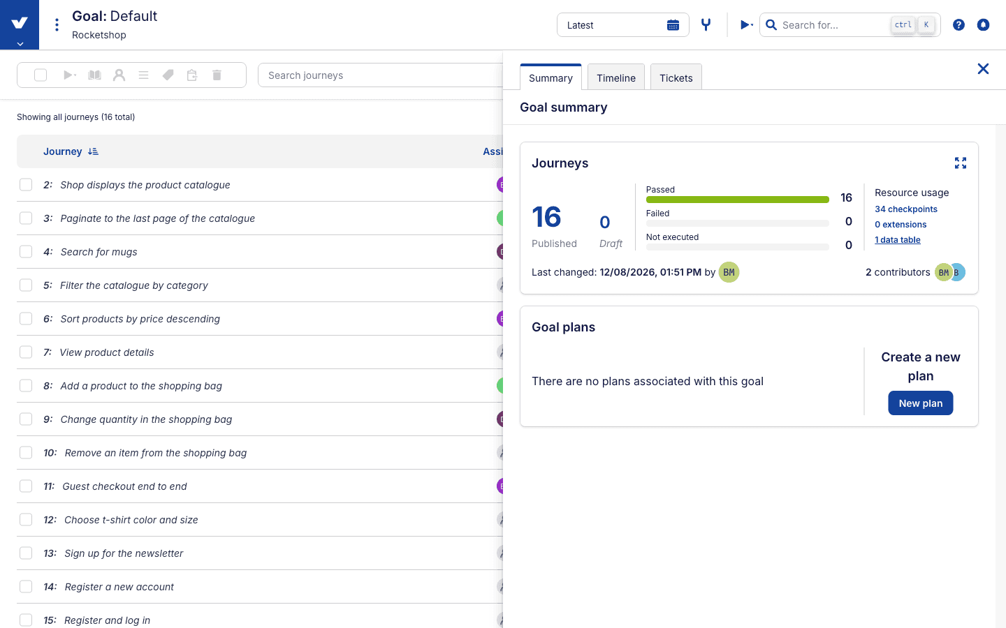
The panel's state is part of the page URL, so if you share a link while the summary is open, whoever opens it will see the same view you do.
# Journey quick look
The new quick look pane gives you a detailed picture of a single journey without navigating away from the list. Open it by clicking a journey's Health cell, or the test data icon at the end of a row to jump straight to the journey's data source.
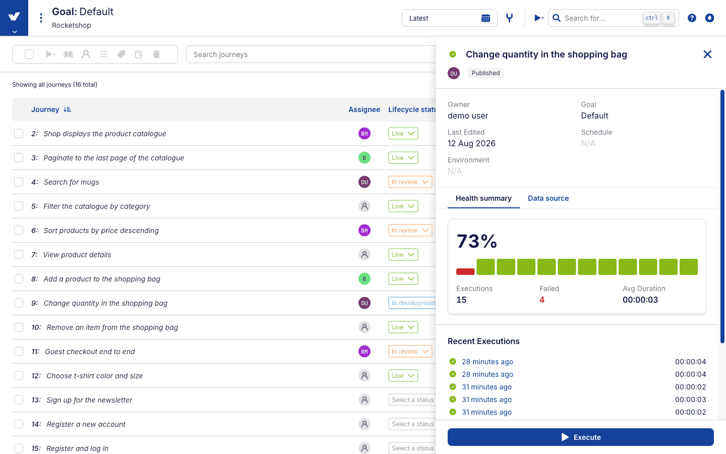
Quick look shows the journey's latest outcome, draft/published status, and assignee at the top, a summary of its key details, and two tabs:
- Health summary — the journey's recent execution history and pass-rate trend, so you can see at a glance whether a failure is new or part of a pattern.
- Data source — the test data table driving the journey.
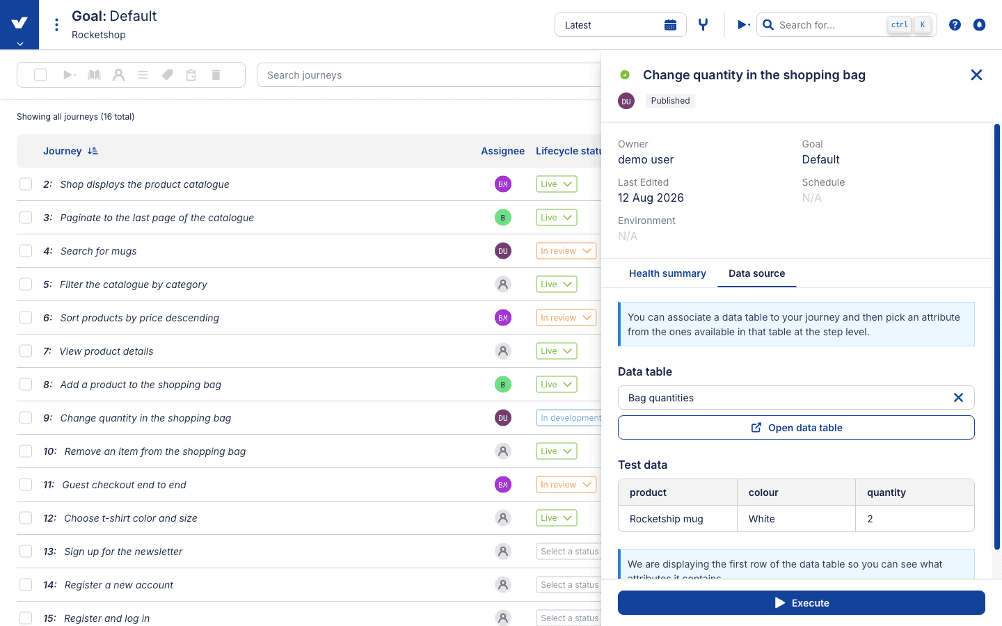
You can execute the journey directly from the pane's footer. Like the summary panel, the open quick look is reflected in the URL, so a link shared with a teammate opens with the same journey in view.
# Everything else, still one click away
Each table row keeps the classic per-journey actions close at hand: rename a journey inline by clicking its title, change its assignee or lifecycle stage from dropdowns right in the row, execute it with the play button, or open the journey options menu for the full set of actions (execute with advanced options, copy, manage test data, publish or unpublish, delete). Clicking the journey's name still takes you into the journey to view and edit its checkpoints and steps — the journey view itself is unchanged.
# Quick reference
| Task | Classic | New experience |
|---|---|---|
| Browse journeys | Cards in a left-hand panel | Full-width sortable table |
| Sort journeys | Not available | Click a column header |
| Search journeys | Search box above the list | Search box in the toolbar |
| See the goal summary | Always visible on the right | Toolbar button opens a slide-out panel |
| Inspect a journey's health | Open the journey | Health column, or quick look pane |
| See a journey's test data | Open the journey | Test data icon opens quick look |
| Add a journey | Card at the bottom of the list | Add journey button in the toolbar |
| Bulk actions on a selection | Toolbar above the list | Same actions, same toolbar |
# What hasn't changed
Searching, selecting, and every bulk and per-journey action behave exactly as they do in the classic experience — only where you find them has changed. Opening a journey to author checkpoints and steps is untouched, as are executions, snapshots, and version history. If your organization doesn't have the new experience yet, the classic journey list continues to work as always.